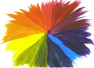
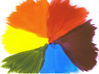
When it comes to
colour there are a number of important things we need to be aware of. Most elementary would probably be the colour
wheel. The colour wheel is divided into Primary, Secondary and Tertiary colours.
Primary
colours
The colours Red,
Blue and Yellow are called primary colours in their purist form. When studying the reactions of colours it has
been discovered that essentially all colours can be mixed from a combination of
these three colours. When all three
primary colours are mixed together a gray or neutralized colour is achieved. (Some literature refer to the mixing of the
three primary colours to form gray as tertiary colour).
Secondary
colours
Secondary
colours are mixed from two primary colours in equal amounts:
Red + Blue = Violet
Blue + Yellow = Green
Yellow + Red = Orange
Tertiary
colours
There is no
general consensus as to what is meant by tertiary colours. Some literature refers to the mixture of
secondary and primary colours as tertiary colours. Some call these mixtures intermediate colours. Some literature suggests that tertiary colour
is derived from the mixing of the three primary colours into a neutralized gray
as tertiary colour.
A third school holds
that tertiary colours consist of a mixture of secondary colours and are thus
restricted to three colours, namely olive, citrine and russet.
In order to
avoid confusion and so as not to get trapped in a battle over semantics it has
been decided that for the purpose of this discussion we shall accept the mixture of
1 part primary colour and 1 part secondary colour as the group which we shall
call tertiary colours:
Red + Violet = Red-violet
Violet + Blue = Blue-violet
Blue + Green = Blue-green
Green + Yellow = Yellow-green
Yellow + Orange = Yellow-orange
Orange + Red = Red-orange
Temperature
Another
important aspect of colour is that it has a temperature. Generally the more the colour leans toward
the blue side of the colour wheel, the colder it is. Also the more it leans toward red or yellow,
the warmer it is. It gets tricky when we
get to mixes. A blue with a mixture of
red in it might be warmer than a blue with a mixture of green in it. Just so, a yellow with some blue in it is
colder than a yellow with some red in it.
However, we do not wish to get too technical. It is merely important to know that humans
attach a temperature value to colours and that it will play a role in our
perception of, and emotional response to a painting when we view the final
product.
It is important
to know that warmer colours tend to advance to the foreground while cooler
colours will recede further into the background. However, this is merely a general rule since
shape, value and context also has important roles to play in determining the
foreground, middleground and background in the composition.
Semantic
Theory
There are words
which you are likely to encounter when dealing with people in the art
industry. A brief and simple explanation
follows to attempt clarification of some very important terminology and key
concepts..
Intensity
A colour as it
comes straight from the tube is at its most intense form. We can add white, gray or black to alter the
intensity of the colour.
Value
Value simply
refers to the lightness or darkness of a colour. Getting the value of a painting right is the
most important thing. You can paint the
sun green and as long as you get its value right, viewers will still be able to
interpret it correctly.
Simply put hue
is colour. When we talk about any colour
we use the word hue to refer to it. It
can therefore be called a synonym for the term colour. For example, red is a hue, orange is a hue,
green is a hue. We can go on forever.
Tint
Adding white to
any colour (hue) results in a tint of that colour. The more white we add, the less intense the
colour turns. Pink can therefore be
called a lighter tint of red. When we add
a lot of white to a painting we say that we are painting a high key painting
and the result is a painting which is light and airy in feeling. It also results in very soft value changes.
Tone
When we add gray
to a colour we arrive at a tone of that colour.
This is called middle key painting.
We are quieting the intensity of the painting and changing it to a
deeper value.
Shade
When we add
black to a colour we arrive at a shade of that colour. When we do this in a painting, it is called low
key painting. Our value range becomes
even deeper and the intensity of our colour range becomes muted.
Full range
When we use the
full value range in a painting, our painting will be a closer reflection of
what we see in nature. This means that
we make use of the full range of white and black in our painting. Greater realism can be achieved by using the
full range.
Caution
When too much
white is added, a picture might become lifeless. When too much gray is added it mat turn drab
and dreary. When too much black is added
the picture could be completely destroyed.
It is therefore prudent to mix in very small quantities and with great
caution.
Transparent
vs. opaque
Some paints are
transparent and others are opaque. It is
important to take note of this quality of your paint when using it straight
from the tube as well as for purposes of mixing colours. Very bright and clear results can be achieved
when a colour is transparent, such as when painting glass or water etc. Opaque colours can achieve more solidity on
the other hand, such as for structures or trees etc.
All water
colours are transparent which would account for the light and airy feel one
gets when viewing them. Generally a lot
of the paper is retained in water colours and allowed to remain untouched for
this very purpose.
Gouache is
essentially also a water colour paint which has been developed to counter this
aspect of water colours. Gouache is
therefore an opaque paint which reacts in every other sense the same as
traditional water colours.
Transparent
When a paint
colour is transparent, it simply means that light can travel through it. The result is that the eye will be able to
see through the colour to whatever is beneath it. This can be compared to putting on a pair of
dark tinted glasses (shades). It changes
the value of the objects around us, but they are still visible.
Transparent Watercolors
Transparent Acrylics
Opaque
Opaque colours
will not allow light to travel through it.
Instead the light will bounce off it and you will therefore not be able
to see through it to what lies beneath.
Opaque colours are very useful for fixing mistakes.
Opaque Gouache
Opaque Acrylics
Mixing transparent and opaque paints
When two
transparent paints are mixed together the resulting colour will still be
transparent. Likewise when two opaque
colours are mixed together, the resulting colour will still be opaque. However, when a transparent colour is mixed
with an opaque colour, it will result in a translucent colour which will have
properties of both groups.
Colour
schemes
There are a
number of colour schemes which have been tried and tested through the years and
has been proven to be successful. We
shall look at some of the more common ones.
Monochromatic colour scheme
In a
monochromatic colour scheme we make use of different values of one single colour. In other words, we select a colour of our
liking which we then mix with a full range of white and black (and gray as the
mix of the two).
Analogous colour scheme
When using only
colours which are adjacent to each other on the colour wheel, we say that we
are doing an analogous painting. These
are also called harmonious colours.
Complimentary colour scheme
Complimentary
colours are opposite each other on the colour wheel. We use direct opposites for greatest
contrasts. These colours show each other
off the best. Red and green are direct
opposites, as are blue and orange. Black
and white are also direct opposites even though they do not appear on the
colour wheel. Black and white are not
considered colours as black absorbs light and white reflects it.
Split-complimentary colour scheme
In a
split-complementary colour scheme we make use of a colour and the two colours
adjacent to its complimentary colour.
For instance: we select the colour red.
Its complimentary colour is green.
We do not use green, but rather the two colours right next to it, namely
yellow-green and blue-green.
Double complimentary colour scheme
In a double
compliment we make use of two pairs of complimentary colours, e.g. red and
green as well as yellow and violet.
Tetradic colour scheme
In this colour
scheme we make use of any four colours on the colour wheel which have a logical
relationship to each other. The
double-complimentary colour scheme would therefore be an example of this.
Printing
colours
Printers do not
make use of the same principles as art for mixing colours. In printing all colours are mixed from the
three colours cyan, magenta and yellow.
Black is added as a fourth colour to prevent saturation of colours, in other words, to prevent using so much
colour to create black that the paper will not be able to contain it.
Shadow and Light
A painting only
comes into its own once you add light.
In other words, once you consider the source of light in the painting
and shows where it illuminates and reflects in the picture that is when it
comes into its own. In that sense it is
very much like all of us in our relation to our Source of light as well.
Remember to keep nurturing your TALENT for making PRETTY things.
You can subscribe to this blog and receive regular updates by email by simply registering your email address at the top of the current blog.


No comments:
Post a Comment