Search This Blog

Sunday 30 April 2017

Recognizing Your Own Voice In Art

One of the things that I enjoy most about art, is the fact that it is so comprehensive and widely diverse. I find it thrilling to experiment with different styles, mediums and art movements. I believe all artists should do this to challenge themselves and to keep growing and developing as artists. Often, when trying out new things, you will find yourself understanding other artists and their art better. Simply working through the process, is enlightening in itself. This practice will also help you to find your own voice in art. Art is a way of expressing your thoughts and ideas to the world. In today's blog, I show you how such and experiment helped me to discover more about myself and my own voice in art.


I start this project on a sheet of Prime Art Canvas Pad.


I tear one sheet of canvas from the pad to paint on.


I then mix turpentine and Raw Sienna on my palette.


I use a clean cloth to cover the background in the turpentine and paint mixture.


This is what my canvas looked like with the background painted.


I then mixed a light blue from Phthalo Blue and Titanium White.


I painted the sky and the stream in this colour mix.


Next, I used Burnt Umber for the shadow sides of my trees and Red Ochre for the sides exposed to the light.


Hold your brush at the end to relinquish control of the brush when painting the tree trunks and branches.


Remember to consider the direction your light comes from when painting light and shadow areas.


Dark patches are added to start a definition of the ground.


Further definition is added.


I mixed my own black from Permanent Violet and Phthalo Blue.


This was used to paint the more distant trees.


Foliage would be added using Hooker's Green, Prussian Green and Yellow Green.


Foliage is added.


More foliage is added.


Time to add the happier colours and sun patches. I used Cadmium Orange, Deep Cadmium Yellow and Pale Cadmium Yellow.


Foliage and light patches are added.


The foreground is developed.


More defined foliage is added to the foreground.


I now brought Naples Yellow to the painting.


Sunny areas were added along with highlights.


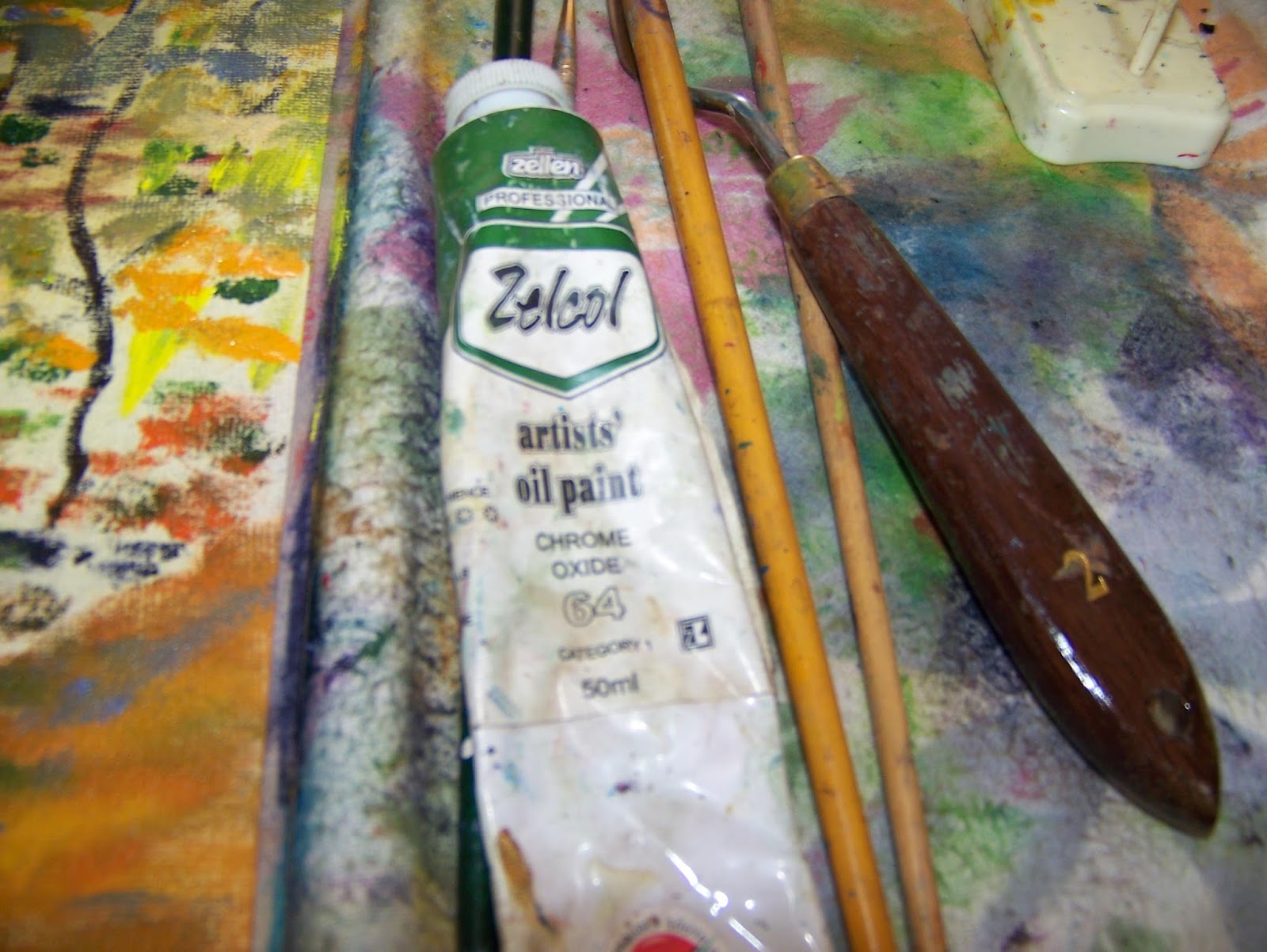
I decided to add yet another green by bringing Chrome Oxide to the painting.


I painted bushes and grass into the painting by flicking a fan brush across the surface.


The completed painting left me with a feeling that I should go home and work some more on the painting. However, I probably never will, so I might as well add this blog now. This painting has too much clutter to satisfy me. I am an organized person by nature and this painting has ceased to be my voice. Throwing more paint at it, will not satisfy me. This is why it is true that art always tells you something about the artist behind it, even if it only tells you more about their dislikes than their actual likes. Have you found your own artistic voice yet?


Marietjie Uys (Miekie) is a published author. You can buy the books here:
You can purchase Designs By Miekie 1 here.
Jy kan Kom Ons Teken en Verf Tuinstories hier koop.
Jy kan Kom Ons Kleur Tuinstories In hier koop.
Jy kan Tuinstories hier koop.
You can follow Miekie's daily Bible Study blog, Bybel Legkaart, here in English & Afrikaans.
For more crafty ideas and great products, visit A Pretty Talent on Facebook.
Remember to keep nurturing your TALENT for making PRETTY things.
You can subscribe to this blog and receive regular updates by email by simply registering your email address at the top of the current blog.

Saturday 29 April 2017

Paint An Expressive Giraffe In Oils

One can not travel through Africa without being inspired by its animals. The giraffe has always held a great fascination for me, as for many others. In today's blog, I paint a fairly normal giraffe, but I make use of more expressive brush strokes so that the painting does not become simply another tranquil nature scene. Instead, I force the viewer to take note of the subject. I also create slight tension between the giraffe and its surroundings by allowing it to run off the canvas.


The reference I used for the painting, is this photo. I used only part of the younger giraffe, that is lying down.


I worked on a sheet of paper torn from a Rolfes Gouche Pad.


This paper is very strong and handles paint well, although it has a very distinct repetitive pattern.


I draw a very rough outline of the parts of the giraffe that I choose to use, in charcoal.


I brush the loose charcoal particles away with a clean, dry paint brush.


I have a couple of colours that are very close to each other in appearance and deciding which to use, can be tricky. I ended up having to paint test samples before being able to settle on a colour.


I decided it would be wise to do an underpainting first, using Derwent Inktense blocks.


The underpainting gave me a clear idea of where I needed to go with the oils.


I started on the distinct markings of the giraffe. I used a palette knife and worked with very rough strokes of the knife.


The main was painted with a short-bristled hog hair brush.


The skin was filled in with a palette knife, using Yellow Ochre.


I also brought in Buff Titanium for the lighter areas.


I largely stuck to the palette knife and did not tidy up any of the strokes.


Payne's Grey made up the darkest areas on the giraffe.


This is the palette I've worked with.


I now added splashes of Ochre to the background.


This was followed by different shades of green.


Finally I added some Permanent Violet to create the shadow areas in the background. Some touches of blue was also allowed to make surprising appearances on the canvas.


My final palette.


The completed painting.


Marietjie Uys (Miekie) is a published author. You can buy the books here:
You can purchase Designs By Miekie 1 here.
Jy kan Kom Ons Teken en Verf Tuinstories hier koop.
Jy kan Kom Ons Kleur Tuinstories In hier koop.
Jy kan Tuinstories hier koop.
You can follow Miekie's daily Bible Study blog, Bybel Legkaart, here in English & Afrikaans.
For more crafty ideas and great products, visit A Pretty Talent on Facebook.
Remember to keep nurturing your TALENT for making PRETTY things.
You can subscribe to this blog and receive regular updates by email by simply registering your email address at the top of the current blog.

Friday 28 April 2017

Mix An Alternative Black To Paint A Sunset In Oils

Having shown you how to paint a bright sunrise in a previous blog, I thought it would be a good idea to paint a sunset as well. With the light coming from behind the vegetation, the foreground of a sunset often appears as dark silhouettes against the bright light behind it. The obvious solution is to paint the foreground in black. However, black can easily seem dull and lifeless. That is why I mix an alternative black to paint today's sunset, allowing the silhouettes to sparkle and have a life of their own.


This painting is painted on a sheet of canvas torn from a Prime Art Canvas Pad.


The canvas sheet has already been primed to accept paint.


I draw only a very rough line with charcoal to indicate the lay of the land.


The land is silhouetted against the setting sun and is therefore painted in black.


As black can often appear dull and lifeless in a painting, I prefer to mix my own alternative black from Prussian Green and Permanent Violet.


I then paint the open spaces on the canvas with Raw Linseed Oil.


I paint Brilliant Orange over the oil for the warmest tones of the sunset. The colours of the setting sun is also reflected in the water.


I paint Pale Cadmium Yellow on the horizon, steering clear of the top of the canvas. The yellow is also repeated in the water.


The bright setting sun is painted in Titanium White and its reflection is painted in the water.


I now return to my alternative black. Grabbing a round long-stemmed brush by its end, I add the silhouettes of trees to the scene.


I use a Fan Brush to dab leaves onto the trees, still sticking to my mixed black.


A Filbert brush creates the silhouettes of brushes.


A few more trees are added before the painting is done.


Marietjie Uys (Miekie) is a published author. You can buy the books here:
You can purchase Designs By Miekie 1 here.
Jy kan Kom Ons Teken en Verf Tuinstories hier koop.
Jy kan Kom Ons Kleur Tuinstories In hier koop.
Jy kan Tuinstories hier koop.
You can follow Miekie's daily Bible Study blog, Bybel Legkaart, here in English & Afrikaans.
For more crafty ideas and great products, visit A Pretty Talent on Facebook.
Remember to keep nurturing your TALENT for making PRETTY things.
You can subscribe to this blog and receive regular updates by email by simply registering your email address at the top of the current blog.