Dala sent me a selection of their Blackboard Paints, which included the following colours: Green, Black, Light Grey, Light Blue, Navy, Maroon and Pink. A number of other manufacturers sell similar products, named Chalkboard Paint, but I prefer Dala's name as I find the term Chalkboard Paint to be confusing to my readers (and myself!). There is a type of paint on the market called Chalk Paint. This is a very versatile paint that is largely used to treat furniture and ornaments. It derives its name from its distinctive chalky finish. This paint is not to be confused with chalkboard paint, or Blackboard Paint, as Dala calls it. Blackboard Paint is used to treat surfaces that you want to write on with chalk sticks.
(A word on the side: Dala also has a wonderful range of Chalk Paints out, which they sell under the term Craft Chalk. I have not had an opportunity to test it yet, but if it at all comparable to the rest of Dala's products, it must be brilliant indeed. This paint comes in a range of 12 delectable colours. I will try to get my hand on some to give you more feedback on these as I know that a number of my readers are very interested in Chalk Paints).

I started off by testing the colour intensity of the range on untreated wood. I stuck to a principle of applying only one coat of paint, knowing well that I really should apply at least two coats for optimal results. As you will see, one coat already gave brilliant results, a good indicator that I would almost never need more than two coats of paint. Brilliant! Here I show you the Green.

Black covered the wood exceptionally well.

Light Grey also gave a very good coverage.

Light Blue had excellent coverage.

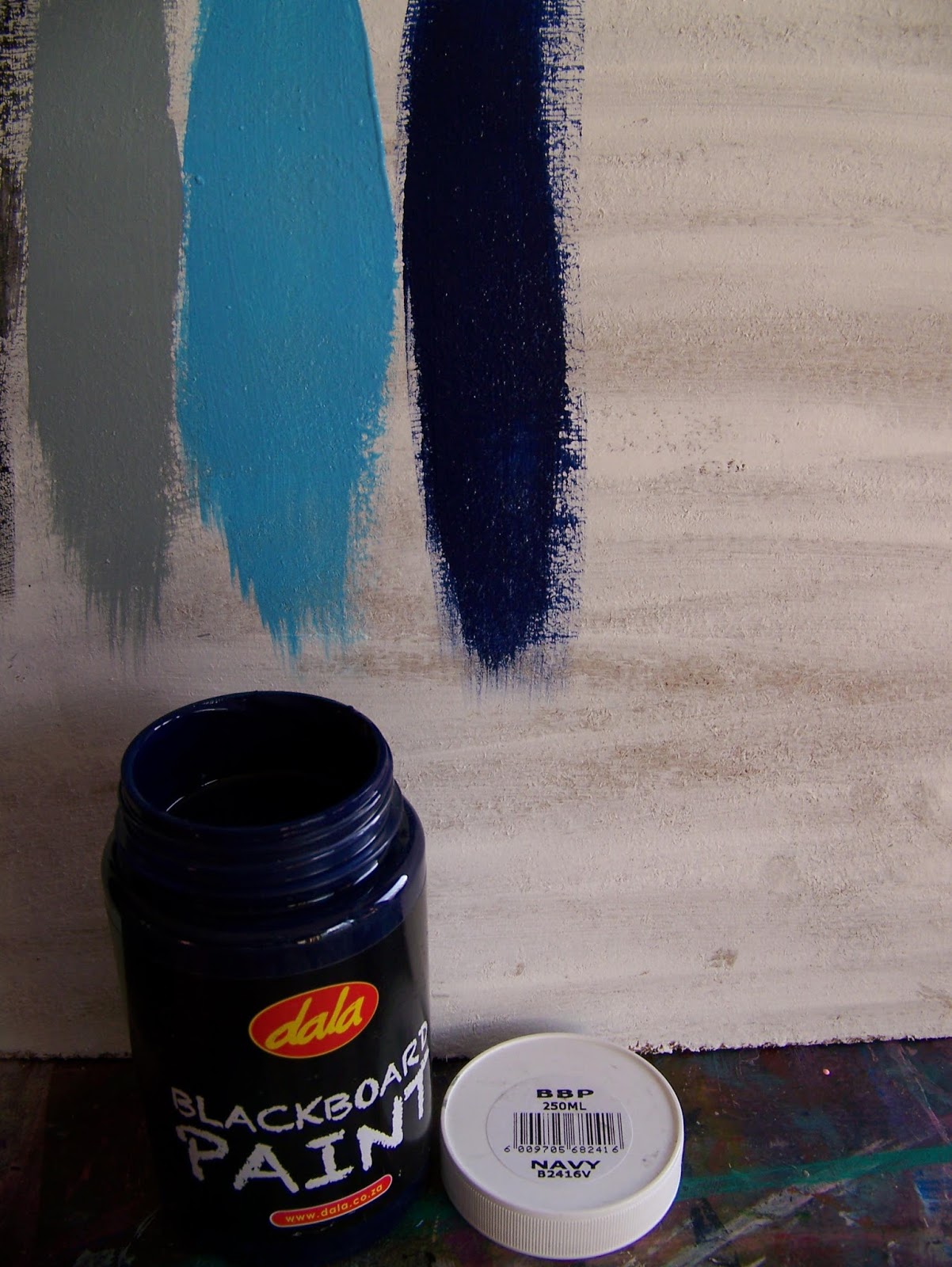
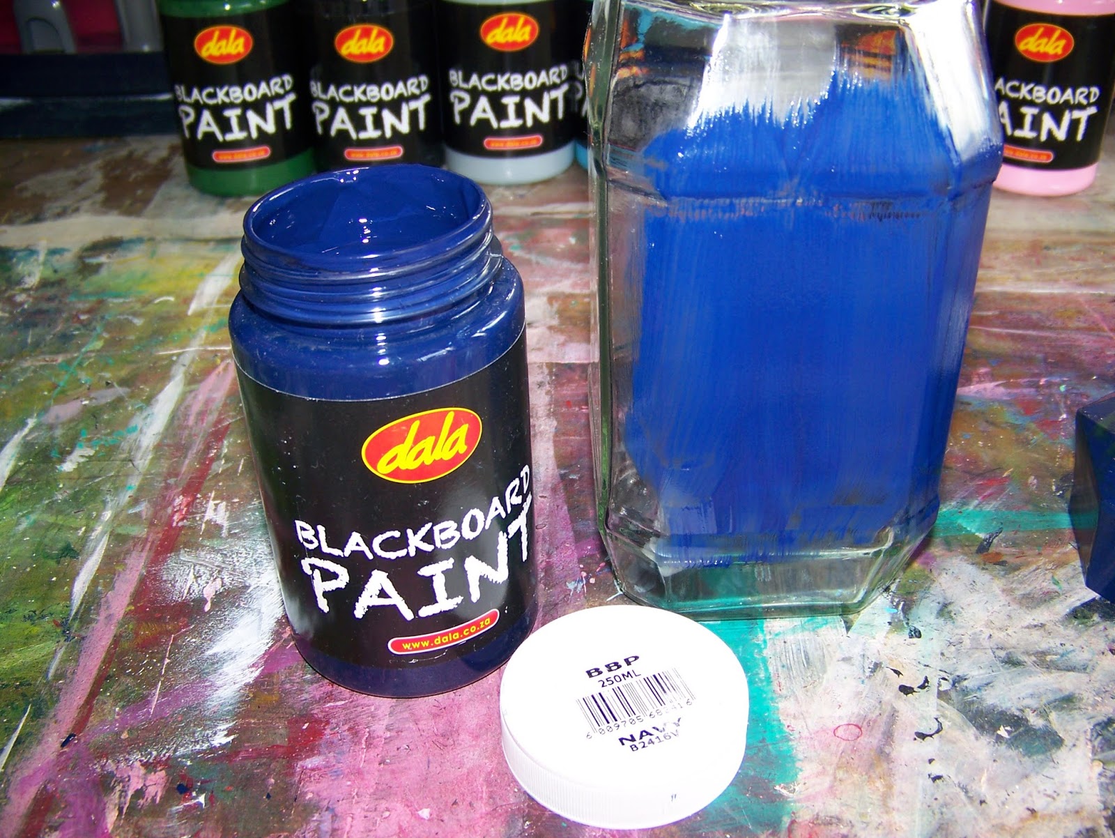
Navy compared well.

The maroon was really good, but a little more transparent than the others.

The Pink compared to the Maroon.

I then flipped the board over to the reverse side which had been painted with Dala Gesso. This white surface would give me more brilliant colour results and reflect the true colours of the paint better. I started with a repetition of the same sequence of paints. laying down Green first.

This was followed by Black, which impressed me even more than on the reverse side.

Light Grey once again performed brilliantly.

Light Blue seemed to pop off the wood and invite you in to place of peace.

Navy was excellent. Looking at the three colours in the photo, I can not help but excited about upcoming projects. Don't you think that is a marvelous monochrome combination?
Add the maroon to the colour scheme, and things get even more interesting.

Now, these three colours side by side makes me think of fantasies and fairies. The Pink looks so delicious I want to eat it for candy floss!

Let's compare the results for the two different surfaces side by side. Isn't it marvelous how well this paint performed even on the untreated wooden surface?


I then get the idea to experiment even more by mixing the colours and seeing how well they respond to this treatment. I start off with a dollop of Pink.

I add a dash of Maroon to the Pink.

The two colours are mixed with a palette knife and I LOVE the result. Let's see what it looks like next to the original colours.

I am very happy with the results, especially since it means that I will be able to get a variety of shades, tints and new mixes from the seven basic colours at my disposal. No doubt I'll be sharing these experiments with you in upcoming blogs as well.

This is when I turn my attention to the label on the bottle. There is some truly useful information here, but what catches my attention is the claim that the paint will stick to a variety of surfaces, including masonry (walls), un-glazed ceramics, wood, polystyrene, glass and metal. Wow! Well, we'll have to test that. I don't have all of those surfaces at hand, but some will do for a start.

The easiest to find was this piece of polystyrene left over from a previous experiment on glue. The paint reacts wonderfully to the polystyrene and there is no indication of it melting the surface. Love that!

I then find this old rusted mining spoon that I've been meaning to pretty up for ages.

The paint goes on like a dream!

Next, I go in search of glass. I often use these empty coffee bottles for projects, loving their shape. Having one ready, I decide to experiment on it.

A single layer of paint adheres well to the glass, but leaves me wanting a more solid coverage.
A second coat leaves me satisfied, but I suspect that a third will thrill.

While waiting for the coats to dry at least a little bit, I dabble on the plastic lid lying next to me. The paint lays no claim to being able to stick to plastic, yet I am wonderfully surprised and pleased with the results. I will let this first coat dry to see how far I can push my luck with this. Look out for more on this in upcoming blogs.

In the meantime, my paint has dried only just enough for me to apply a third coat. Beautiful! This has me very excited!

Of course the true test of Blackboard Paint is to see how well it behaves when you write on it with chalk. Ideally, the paint should be allowed to dry overnight, but I rush things a little by writing on it when it is only touch dry.

I am immensely impressed. Well done Dala!

Marietjie Uys (Miekie) is a published author. You can buy her books here:
You can purchase Designs By Miekie 1 here.
Jy kan Kom Ons Teken en Verf Tuinstories hier koop.You can purchase Designs By Miekie 1 here.
Jy kan Kom Ons Kleur Tuinstories In hier koop.
Jy kan Tuinstories hier koop.
For more crafty ideas and great products, visit A Pretty Talent on Facebook.
Remember to keep nurturing your TALENT for making PRETTY things.
You can subscribe to this blog and receive regular updates by email by simply registering your email address at the top of the current blog.