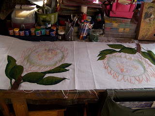
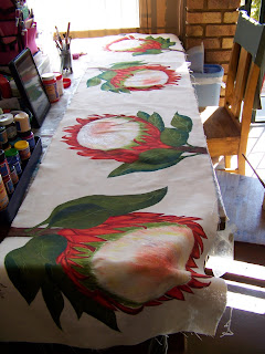
In Part 1 of this project we carefully planned and drew the Proteas on the runner. We then started adding color with Acrilpen, outlining the various parts to make the drawings clearer and to add essential shadows. Today we start painting in all earnest.
I started by coloring the stems of the flowers with Derwent Inktense pecils. Once these are painted with water, they are permanent, which makes this a brilliant product to use in fabric painting. However, once I had painted the green leaves surrounding the stalks, I no longer liked the effect from the Inktense pencils and I covered it with fabric paint. I therefore merely add these photos so you will understand why the stalks in the blog has this color, which would not be clear if I did not add these.
I use Dala fabric paint for this project. I start by painting the leaves a solid Olive. I prefer to work with an angle brush, since it allows me to work into the corners.
I add the reflection of the sunlight on the leaves with Ochre.
The veins of the leaves are drawn into the wet paint with the back of the paint brush. This is called Scgraffitto.
The shadow is added to the leaves with Blue. (Yellow and blue mixed together gives green. It is therefore natural to paint the highlights in yellow and the shadow in blue).
This is what the leaves look like once finished. Can you see why I did not like the effect from the Inktense any longer?
I now use brown fabric paint from Heritage to paint the stalks.
The brown is too solid and I need to create a highlight. I use oxide for this purpose, painting the left side of the stem in this color. The brown underneath tones it down so it is not too intense.
I again use the back of the brush to scgraffitto detail into the stems of the flowers.
Doing all of the leaves on one sitting is a good idea since it is easier to achieve uniformity in this manner.
Close-up of the leaves once finished.
Before I start on the petals for the flowers, I paint a test sample on a rag. I will not work on the actual fabric until I am satisfied with the test flowers. This result suited both myself and the client.
I bought a big tub of Crimson to use as base for the petals.
I noticed that none of the previous blogs showed clearly the size and shape of the brush I was using. It is a no 8 Angle brush. This is an odd numbering though, since many manufacturers use fractions to size the angle brushes. In fractions this would be 1/2.
I paint the whole petal with the Crimson. The crimson is actually not as bright as the photo shows it to be, but the color reacts to the flash and gives almost a neon shine. Some colors do this, but the color has no sign of neon brightness to the naked eye.
I will now use bright Red on the petal.
The Red is painted on the sides of the petal.
Now I will paint the highlights with Yellow.
The Yellow goes in the center of the petal.
Brown will be used to create depth.
The Brown goes in the deep shadow areas. Every single petal will be painted with these four colors.
Once you have a small grouping of petals painted, you can see how the color scheme comes together.
This is what the flower looks like once the petals are painted.
I did not like any of the existing colors for a background color and decided to mix my own. I always use a palette knife for mixing paint because of how well it manages to mix the paint well through. I dollop a generous helping of white into a bottle.
I then scoop a gentle amount of flesh into the white.
I am pleasantly surprised with the outcome. I would have thought I would need to add some brown as well, but this color is spot on.
When I paint the mix onto the fabric, the difference is hardly perceptible, but the color will deepen slightly as it dries and the cloth will appear more finished than if I leave it at its natural color.
This is the finished background. I now need to work on the centers of the flowers.
I use the same mix that I've used for the background to paint the centers of the flowers.
I paint the focal point with the same Crimson that I've used as base for the petals.
Smudges of Crimson lower down in the flower center helps to shape the cone. Use a dry brush with very little paint to achieve these smudges.
Scratch detail into the flower center with the back of the paint brush; this is called scgraffitto.
I repeat the Olive Green from the leaves to paint the sides of the cone of the flower center.
I brighten the green by painting Yellow over it. I also make yellow smudges in the cone of the flower.
Again, I scratch detail into the wet paint with the back of the brush.
This is what the finished flower looks like. Three more to go!
When the painting is done, I leave the runner to dry in the sun.
When the paint is dry, I trim the seams.
Fold the corner in as shown.
Fold both sides in as shown.
Fold the sides in once more, this time meeting in the middle.
You have now folded a very neat corner for the runner. Repeat the steps in the remaining corners.
Fold a rolled hem (folded over twice) all around the four sides of the runner and pin it in place.
Sew all around the four sides of the runner.
Heat sets color. Ironing the runner is not optional. You HAVE to iron it to fix the color. Add salt to the first wash (which should be in cold water). Salt and heat will both set color. After that first wash, you should be able to wash the runner with the rest of the washing and it should retain its color beautifully.
What the runner looks like on the kitchen table.
For more crafty ideas and great products, visit APrettyTalent.com.
Remember to keep nurturing your TALENT for making PRETTY things.
You can subscribe to this blog and receive regular updates by email by simply registering your email address at the top of the current blog.


No comments:
Post a Comment