
I start with a canvas that has already been primed to accept paint.

The size of the canvas is A2, or 42 x 59,4 cm.

The first thing I do, is to insert the corner supports for the canvas.

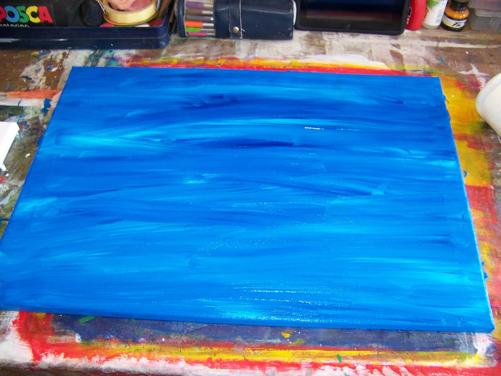
I then start with an acrylic undertone for my painting that I mix on the canvas with Phthalo Blue and Titanium White.

I roughly put the paint on the canvas.

I then paint the background with quick strokes of the brush.
Let me talk to you about palette knives in general while I wait for the acrylic undertone to dry. To start with, they come in metal and plastic. Some people swear by one and others swear by the other. I use both. I find the plastic in general softer and more bendable. It does however depend on the size, shape and make of the palette knife. For every rule there exists an exception.

Palette knives come in different sizes. I mostly use the large knives when I work on large canvasses. Small knives are used for more detail work and smaller spaces.

Plastic palette knives mimic their metal counterparts very well.
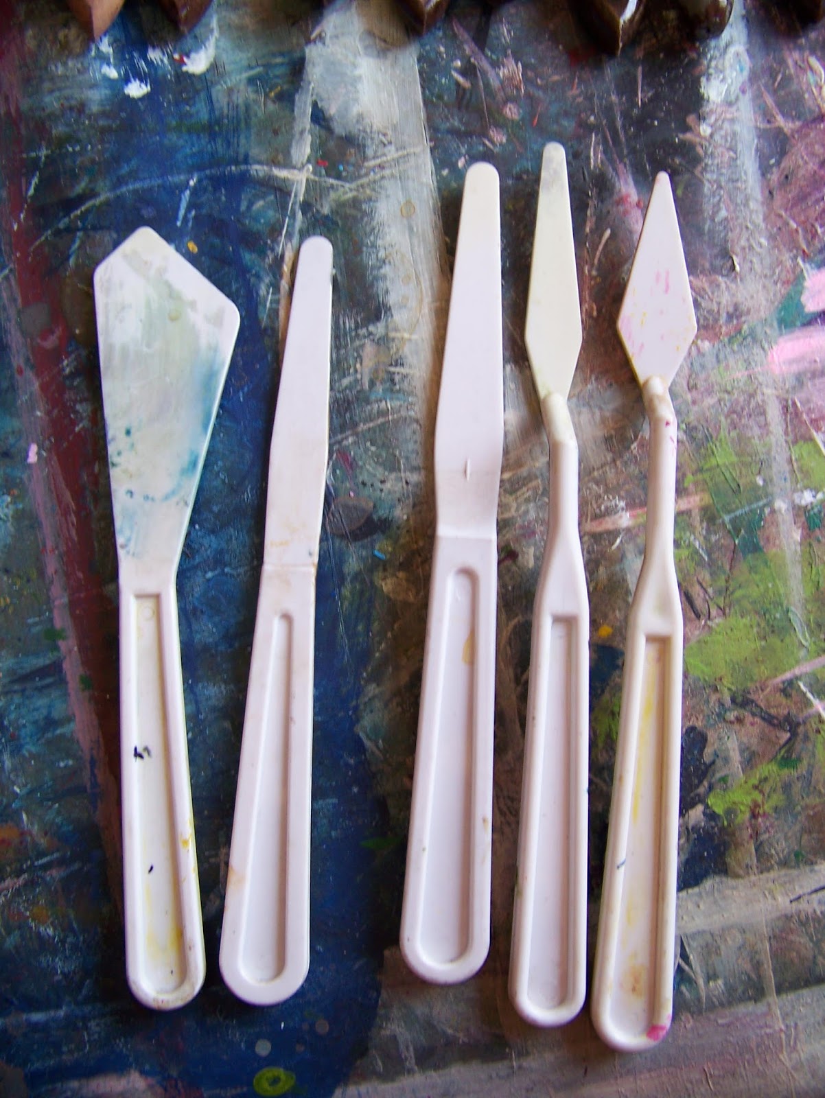
Here I have two different palette knives of the same size, a no. 1. At first glance it may appear to be the same thing, but pay attention to the blade. Note that one is more angular than the other. Palette knives come in all different shapes. It is best to experiment with the knives to find out what strokes they are capable of making.

Another major difference is that some knives are straight and others have a bit of a lift in the handle. This lift is very helpful in keeping your hands off the canvas and out of the wet paint!

You will also find that some palette knives have a smooth finish, while others may have ridges, or scallops, or various other shapes.

I have stopped printing out my photos and prefer to put them on my iPad. This makes it easy for me to zoom into a certain spot, or to even put a grid on the photo if I feel the need. This photo was taken on a recent trip to Hondeklip Bay (Hondeklipbaai) in the Northern Cape of South Africa. I will use this as my main reference photo. However, I do not like the monotony of the sky, or the distinctive line on the horizon. I will change this in my painting.

I go to this photo I took in Lambertsbaai, during the same trip, for inspiration for the sky. I will not do it exactly like this, but it gives me a good starting point for my painting. Remember that water will always reflect its surroundings, even if that simply means it reflects the sky above it. Bear this in mind when making changes.

I start by mixing Phthalo Blue and Titanium White in oil colours. These are the same two colours I used in acrylics for the under-painting.

I apply the paint rather evenly over the top third of the canvas to begin my sky. You will note that I have mixed a whole lot more white into the blue this time around. I use a smaller palette knife to make down and sideways strokes, making sure it does not seem too random.

I work alla prima (wet on wet) throughout this painting. I have now switched palette knives and add very choppy white to the blue. I need to touch the canvas very lightly to prevent the bottom from mixing with the top. Again, I use rather random strokes.

I then add my darkest shade to the sky, which is Payne's Grey.

I apply the dark shade randomly before starting to blend the colours more evenly.


You will note that this method allows me to lay down all the colours in one smooth stroke, still retaining the integrity of each individual colour.

I repeat these steps to the middle third of my painting, which is the ocean, reflecting the colours of the sky above it. Note that I have softened the horizon line into almost oblivion. This aids in creating the impression I want to leave the viewer with when I am done. I am stripping the painting of detail, blending distinct features, so as to give the viewer a soft and soothing place to rest the eyes. It is only when standing back from the picture that shapes will slowly identify themselves and the picture will start to take shape. If I can achieve this, I have reached the goal I was aiming for. When I reach the bottom third of the painting, I start by laying down large areas of white. This is where the surf starts as the water crashes onto the rocks, forming foam on choppy waters.

I am now ready to start on the rocks. I start with a very dark Burnt Umber.

I switch palette knives again as I will be doing more detail work on the rocks, although preventing the painting from becoming too detailed. I make choppy, random strokes in all directions, sometimes picking the surrounding colours up and pulling them into the rocks. Rocks also reflect their surroundings, especially when they are wet. Dragging the surrounding colours into the rocks helps to create the reflections.

Progress photo.

The focal point on my painting is a rock that is slightly deeper into the surf, where I will add a giant splash. This one is wetter than the rest of the rocks and appear slightly lighter in colour. I drag more white into this rock. My strokes also mimic the direction of the water spilling over the rock.

I fill in the missing ocean, dragging the brown into the white. Remember the principle of reflections!

Progress photo.

It is at this point that my easel starts to irritate me as it is getting in my way of painting the bottom of the canvas. I lift the painting off the easel so I can tend to the bottom of the canvas.

I return to Payne's Grey to add the deep shadows on the rocks.

Random strokes create the shadows I am looking for.

Progress photo.

When starting the highlights I turn to a surprise colour. Adding a deep Cadmium Red will help to capture the warmth of the sun as it is reflected off the rocks. You will have to bear with me. It will make sense in good time, although it will seem all wrong to start with.

I add this bright red to all the areas where the sun hits the rocks and reflects off the surface of the rocks.

Progress seems doubtful at this stage.

I now turn to one of my personal favorite colours, Buff Titanium.

I paint this over all the red areas, creating a very warm reflection of light.

Lastly, I add a very brown when I choose Burnt Sienna.

This colour is my middel ground and that is where I paint it on the rocks. It is the neutral colour of the rocks.

I now still need to paint the focal splash and do so with pure white in very short and choppy strokes.

Standing back from the focal point, I decide that if I add more detail, it becomes too obvious, defying the intention of the painting.

Instead of painting my name, I choose to scratch it into the thick paint, called sgraffito.

Surf Splash is available from Marietjie Uys at uys.marietjie@gmail.com. Oil on stretched canvas. 42 x 59,4 cm. R1500. Unframed.

Marietjie Uys (Miekie) is a published author. You can buy the books here:
You can purchase Designs By Miekie 1 here.
Jy kan Kom Ons Teken en Verf Tuinstories hier koop.You can purchase Designs By Miekie 1 here.
Jy kan Kom Ons Kleur Tuinstories In hier koop.
Jy kan Tuinstories hier koop.
For more crafty ideas and great products, visit A Pretty Talent on Facebook.
Remember to keep nurturing your TALENT for making PRETTY things.
You can subscribe to this blog and receive regular updates by email by simply registering your email address at the top of the current blog.
No comments:
Post a Comment