
There is not a single are in this design that is not coloured in less than three colours, and these are allowed to overlap in places, as well. Afterwards, every single area is blended with a white pencil.

I start on the darkest blue.
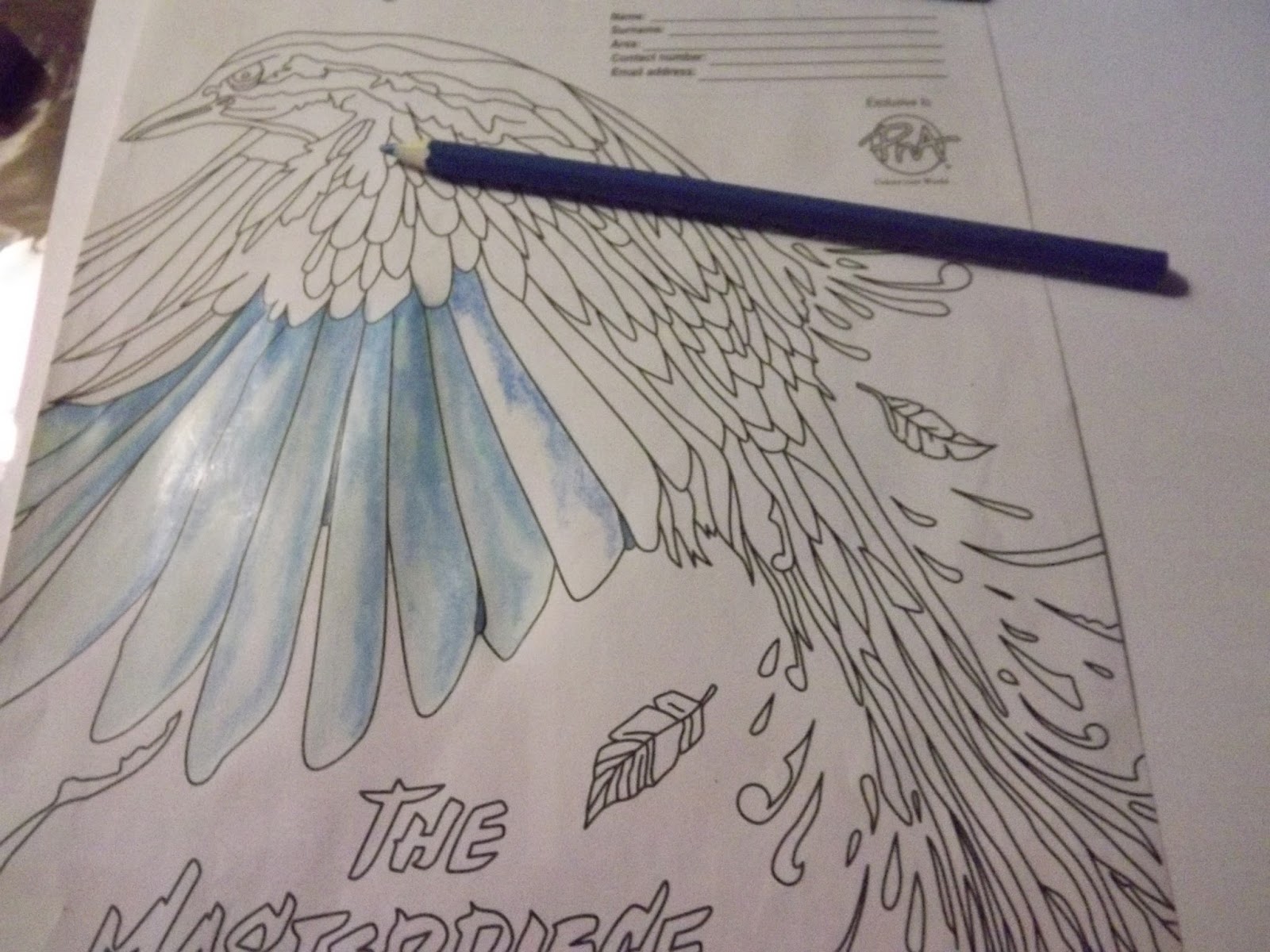
This is followed by the medium blue, and finally the lightest blue.

It is then blended with white. The white is a wax pencil, which gives the picture a bit of a shiny finish as well as to blend the colours.

I use darker colours on some of the feathers, including black and blueish purple.

Start with the black.

Move on to Indigo.

Fill in with dark blue.

Blend with white.

Progress.

I now add some aqua tones, which is mixes of blue and green.

This time I start with the lightest shade.

I move to the medium shade.

The greenest colour fills in the spaces.

Blend with white.

The beak is done in grey.

This is followed by black.

Then orange is added.

Yellow highlights are added.

Blend with white.

The surrounding 'loose' feathers are coloured in the same colour combinations used on the bird. Start with the darkest shade.

Move to the medium shade.

Fill in with the lightest shade and blend with white.

Use all of the colour combinations on the loose-flying feathers.

Even the lettering is shaded.

Again all three shades are used.

Blend with white when done.

The top lettering is done in the shades of the darkest feathers.

Start with black, followed by indigo.

Finish with dark blue and blend with white.

Pay attention to getting the logo of the PNA right.

Even this is done in two shades of red.

Blend with white.

Progress.

Now we need to tend to the background. If the light were to come from the top right corner, the shadows would fall to the bottom left. Use a dark grey to colour the shadows of all the elements on the page, including the lettering.

Fill in the top half of the background with a lighter shade of grey. My grey had a greenish undertone.

Fill in the bottom half of the background with yet another shade of grey. This time the grey had a blueish undertone.

The background is blended with a clean tissue.

The completed picture.
Marietjie Uys (Miekie) is a published author. You can buy my books here:
You can purchase Designs By Miekie 1 here.
Jy kan Kom Ons Teken en Verf Tuinstories hier koop.
Jy kan Kom Ons Kleur Tuinstories In hier koop.
Jy kan Tuinstories hier koop.
You can follow Miekie's daily Bible Study blog, Bybel Legkaart, here in English & Afrikaans.
You may prefer to follow the traveling blog, A Pretty Tourist.
For more crafty ideas and great product reviews, visit A Pretty Talent on Facebook.
If you are in a literary mood, follow Miekie's musings, stories and poetry on A Pretty Author - Miekie.
Remember to keep nurturing your TALENT for making life PRETTY.
You can subscribe to any of these blogs and receive regular updates by email. Simply register your email address at the top of the applicable blog.
No comments:
Post a Comment