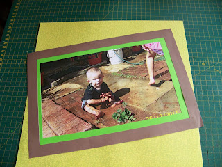
Sometimes in life we need to break the rules a bit and just have fun. These spectacular photos of the kids playing in the mud managed to capture one such time splendidly. We now need to plan our layout carefully to bring justice to the emotion of the photos. This is when I immediately know that arranging things in orderly rows will never suffice. Here we need to steer clear of any rigidity and allow things to cross into each other, run off the page and fall into disarray. Let me show you how to plan this carefully so it doesn't turn into chaos.
I find two printed craft papers that has small flowers in green and yellow on them that I can use as background papers. I like the idea of flowers for a garden layout and the green will give me a nice counter for the brown that I want to use to reinforce the idea of mud.
I have written many blogs explaining how I cut and measure frames so I will not bore you with the details again. Suffice it to say, that I have cut double frames for all the photos from both green and brown. The frames are all 1 cm wide, except for the biggest photo where the frames as 2 cm wide.
The photos and frames are attached with double-sided glue.
I turn this big photo that hardly fits on the page to sit on the background at angles, sticking over the edges on two sides.
I turn the paper over and crop the parts that are sticking over the edges using a metal ruler and a craft knife.
At first glance one can hardly imagine that there is space for another photo on this page, but I find an empty spot in the photo and allow the second photo to cross into the borders of the first, once again sticking out over the sides of the background paper. I will simply crop this again.
The second page has more open spaces, preventing the layout from becoming too cramped and busy.
I add a rectangle in another shade of brown to the layout to do my journaling on. Photos such as these always have stories attached to them! I use a fine-liner to write the journaling by hand.
I use one of the 2 cm wide off-cuts from cutting the frames and cut it in half diagonally.
I attach these two diagonal halves to the sides of the journaling block as almost-frames. Where the one runs off the page, I simply crop it to size.
I now punch a heading for the layout using my alphabet punches. I use the same brown as I used for the frames and punch the letters from the off-cuts left by the frames.
The green backing is also an off-cut left from cutting the frames. Notice how I scattered the letters all over the green backing, mimicking the splotches of mud in the photos.
All that is left to do, is to add embellishments. The green flowers reinforces the idea of being outside in the garden where there really do live frogs, with everyone working hard at conserving the lives of the small garden folk. I again use foam rubber and glitter in the layout, associating both these elements with children. The elements are attached with Tombow glue.
The final layout when I am done.
For more crafty ideas and great products, visit APrettyTalent.com.
Remember to keep nurturing your TALENT for making PRETTY things.
You can subscribe to this blog and receive regular updates by email by simply registering your email address at the top of the current blog.


No comments:
Post a Comment