
I start on a 18" x 24" (45cm x 60cm) stretched canvas that has already been primed with gesso. I use a round brush to sketch my picture roughly in Burnt Umber. The canvas is a Pro Art Canvas.

I start with a very limited palette, using paint from a variety of manufacturers. I use Cadmium Yellow, Pthalo Blue, Ultramarine Blue, Cadmium Red, Titanium White, Burnt Umber, Lamp Black and Pthalo Green.

I worked on a discardable palet and with bigger and smaller brushes as well as palette knives.

I mixed a neutral grey from the Pthalo blue, Cadmium Red and Cadmium Yellow, adding Titanium White to lighten it. I applied the paint in crossing sweeps across the canvas, using the big flat brush in the previous photo.

I then dip the brush in Zellen oil paint medium (the SA version of Liquin) and blend the colours with the medium.

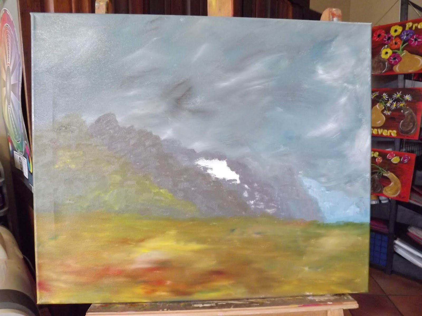
I use a large flat brush to add increasingly warmer shades of grey to the mountains as they advance to the forefront. I warm the grey I used for the sky, by adding red to it.

I continue blocking in the colours in this way.

When I reach the closest mountain, I add much warmer shades to it, although it is still in the distance and should still have cool colours dominating it. The principle at work here is that cold colours recede, while warm colours advance. I also use a lighter pigment in the background, and a stronger pigment as the mountain range advances. This is called atmospheric perspective. I leave a spot unpainted, where the light will hit the mountain and reflect off the white stone.

I use the same palette to fill the middleground and foreground in with much warmer colours. Don't spend too much time on this, as this is still only the phase where we block colours in.

I use the 'Liquin' to blend the colours on the ground.
I added some trees and shrubs in the painting. This I do by simply scrubbing a round brush, dipped in different shades of green, blue and yellow, onto the canvas. I also worked on the white rocks that will be the focal point of the painting.

I wanted to show the students the difference detail would make to the paintings, as they were feeling satisfied with their 'finished' paintings. I used a fan brush for the grasses and then I used a liner to lift out longer individual stalks. I also used the liner to add seeds to the grasses.


I started on a fresh palette when I returned. I used much the same colours, although I swapped out for Alizarin Crimson and a deeper shade of Cadmium Yellow.

I used 'Liquin' and Titanium White to add the direct sunlight hitting my focal mountain in the painting.

Here you can see the unlikely brushes I was working with. The big brush was used to apply the shafts of light. The damaged brush is still very useful for adding rough details.

I now added Burnt Umber and Raw Sienna to my palette.

I started adding details to my mountain range.

Note how I used a palette knife to create different planes, hills and crevices on the mountains. I decided to exagerate the white rocks and increased this drastically. I also made sure to add my darkest colour on the canvas here next to the lightest colour on the canvas. This is is simple technique to use to ensure that the eye is forced to focus on this spot where the greatest contrast occurs on the canvas.

I switched to a small bright to drop a large tree into the foreground.

I light up the right side of the tree, where the light is coming from.

I now add Hooker's Green to my palette.

I dab at my tree with a filbert brush to create the illusion of leaves.

I use a liner to add some individiual twigs to the branches.

I add some greenery to the grasses in the foreground, while making the grass in the distant background bluer and less defined.

I quickly drop a flock of birds to the sky to prevent the eye from roaming off the canvas.

The completed painting.
You can watch a compilation video of the above steps on YouTube:
https://youtu.be/ct_k6CoI0Bw
Marietjie Uys (Miekie) is a published author. You can buy my books here:
You can purchase Designs By Miekie 1 here.
Jy kan Kom Ons Teken en Verf Tuinstories hier koop.
Jy kan Kom Ons Kleur Tuinstories In hier koop.
Jy kan Tuinstories hier koop.
You can follow Miekie's daily Bible Study blog, Bybel Legkaart, here in English & Afrikaans.
You may prefer to follow the traveling blog, A Pretty Tourist.
For more crafty ideas and great product reviews, visit A Pretty Talent on Facebook.
If you are in a literary mood, follow Miekie's musings, stories and poetry on A Pretty Author - Miekie.
Remember to keep nurturing your TALENT for making life PRETTY.
You can subscribe to any of these blogs and receive regular updates by email. Simply register your email address at the top of the applicable blog.
No comments:
Post a Comment