Search This Blog

Sunday, 5 July 2015

Putting Derwent Drawing coloring pencils to the test

Of all the non-soluble coloring pencils I have ever tried, the ones I like best are Derwent's Drawing pencils. The set comes in 24 colors and they are luxuriously soft. The range was specifically developed to draw hair and landscapes and the colors are geared towards this, but I happily tolerate the color restrictions and use them in any subject I like for the mere pleasure of using them. Bear in mind that I have sets of 72 colors available to me when I say that. Let me walk you through this simple little project to show you why I love these pencils so much. (Please note that the Tatty Teddies are not my brainchild and if I knew who to credit with these lovely creatures, I would happily do so).


The only products required for today's project is a set of Derwent Drawing pencils and a sketch pad. Oh yes, you'll also need a good blender, but I'll tell you more about that later.


When I can foresee that I will be applying a lot of pressure to paper, I like to slip a piece of cardboard underneath it to protect the paper in the pad underneath the one I'm working on.


To kick things off, I draw the picture in Ivory Black.


I use Mars Violet for the main body of the rabbit.


The deeper colors on the rabbit, like the inner ears and the soles of the feet, are colored with Ruby Earth.


When the coloring is done, I outline and add definition in Chocolate.


I enliven the eyes by adding some Chinese White and Ivory Black to it.


With the whole rabbit colored, it is time to start blending the colors. I use Derwent's Blender to do this. In this picture I have only blended the pencil in the top ear.


My blender has been worked down to a stump, from which you can see how much I love it, but this is what it looks like when you buy it new. The Derwent Burnisher and Blender set comes with two of each, a sharpener and an eraser.


Both the ears have been blended here. Can you see how much difference it makes to the rest of the face and body which has not been blended yet?
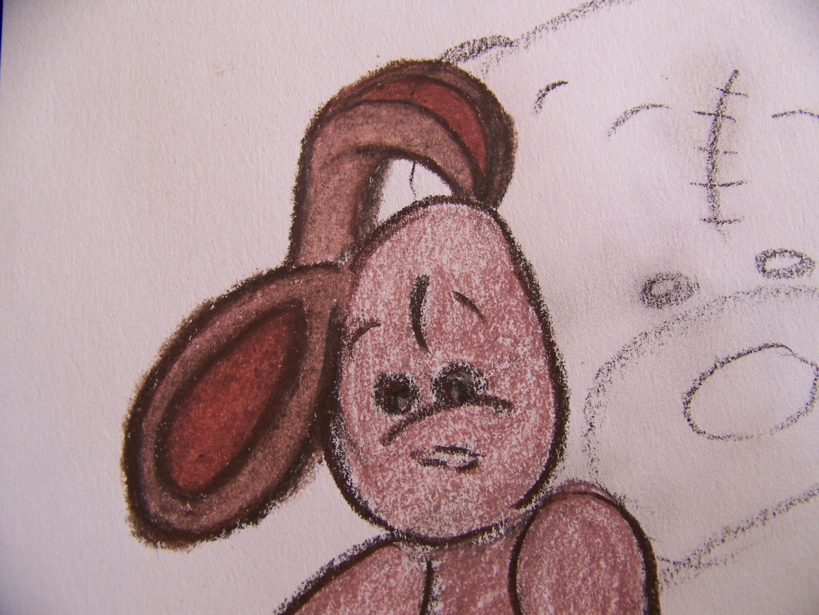

I blend the Chocolate outline first, drawing the dark into the picture.


Only after the outline is blended do I move in to blend the inside of the rabbit. I will follow this rule throughout this project, though it is not a fast rule for blending.


With the rabbit done, I turn my attention to the bear. I start on the nose which is colored in Ink Blue. Remember to leave the shiny spot on the nose white. (I make quick color strokes in random places on the bear in Ink Blue as well).


I use Chinese White to blend the shiny bit on the nose in to the rest of the nose.


I finish the blending job with the Blender.


I use Solway Blue on the outline of the bear. I also color all of the definition lines in the same color.


I color the bear's eyes with Chocolate and Chinese White.


I blend the definition lines of the bear. This will prevent, to a large extent, that it becomes obscured when the color is added in the next step.


I color the bear with Warm Grey leaving only the highlights white.


Can you see where I have added the quick strokes of Ink Blue?
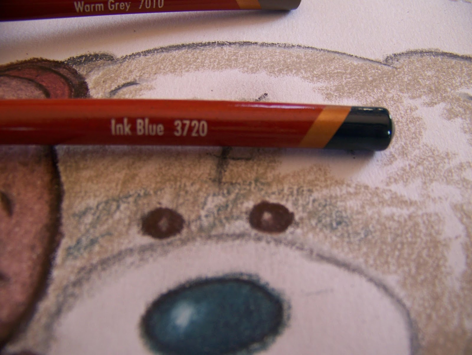

The highlights are colored with Cool Grey.


I start the blending process on the outline, drawing the Solway Blue into the picture.


Here is a close-up of the blended outline.


Blend the inside of the bear. Your coloring and blending should follow the lines of the bear. If the shape is rounded, your lines should be as well.


I make very quick light Ivory Black strokes in the snout area.


Warm Grey is laid on top of the Ivory Black.


I follow the Warm Grey with Chocolate, especially at the outer edges.


I use Chinese White to blend the area directly next to the nose.


Blend the hairy snout.


The rest of the bear is colored in exactly the same manner as the head.


I color the patch in Crop Green and Olive Earth, allowing the two colors to blend on the paper.


The outlines are defined in Ivory Black.


Add clumps of hair in Warm Earth.


Some of my pencils have become blunt and I sharpen these thick pencils in the versatile Faber-Castell Three-Holed Sharpener. I use the same sharpener to sharpen the Blender as well.


Add more hair to your clumps in Chocolate.


Revisit the clumps of hair a third time in Sepia (red).


You can now sit back after a job well done.


For more crafty ideas and great products, visit APrettyTalent.com.
Remember to keep nurturing your TALENT for making PRETTY things.
You can subscribe to this blog and receive regular updates by email by simply registering your email address at the top of the current blog.

Saturday, 4 July 2015

Scrapbooking 11: Working chaotically for the fun of it

Sometimes in life we need to break the rules a bit and just have fun. These spectacular photos of the kids playing in the mud managed to capture one such time splendidly. We now need to plan our layout carefully to bring justice to the emotion of the photos. This is when I immediately know that arranging things in orderly rows will never suffice. Here we need to steer clear of any rigidity and allow things to cross into each other, run off the page and fall into disarray. Let me show you how to plan this carefully so it doesn't turn into chaos.


I find two printed craft papers that has small flowers in green and yellow on them that I can use as background papers. I like the idea of flowers for a garden layout and the green will give me a nice counter for the brown that I want to use to reinforce the idea of mud.


I have written many blogs explaining how I cut and measure frames so I will not bore you with the details again. Suffice it to say, that I have cut double frames for all the photos from both green and brown. The frames are all 1 cm wide, except for the biggest photo where the frames as 2 cm wide.


The photos and frames are attached with double-sided glue.


I turn this big photo that hardly fits on the page to sit on the background at angles, sticking over the edges on two sides.


I turn the paper over and crop the parts that are sticking over the edges using a metal ruler and a craft knife.


At first glance one can hardly imagine that there is space for another photo on this page, but I find an empty spot in the photo and allow the second photo to cross into the borders of the first, once again sticking out over the sides of the background paper. I will simply crop this again.


The second page has more open spaces, preventing the layout from becoming too cramped and busy.


I add a rectangle in another shade of brown to the layout to do my journaling on. Photos such as these always have stories attached to them! I use a fine-liner to write the journaling by hand.


I use one of the 2 cm wide off-cuts from cutting the frames and cut it in half diagonally.


I attach these two diagonal halves to the sides of the journaling block as almost-frames. Where the one runs off the page, I simply crop it to size.


I now punch a heading for the layout using my alphabet punches. I use the same brown as I used for the frames and punch the letters from the off-cuts left by the frames.


The green backing is also an off-cut left from cutting the frames. Notice how I scattered the letters all over the green backing, mimicking the splotches of mud in the photos.


All that is left to do, is to add embellishments. The green flowers reinforces the idea of being outside in the garden where there really do live frogs, with everyone working hard at conserving the lives of the small garden folk. I again use foam rubber and glitter in the layout, associating both these elements with children. The elements are attached with Tombow glue.


The final layout when I am done.


For more crafty ideas and great products, visit APrettyTalent.com.
Remember to keep nurturing your TALENT for making PRETTY things.
You can subscribe to this blog and receive regular updates by email by simply registering your email address at the top of the current blog.

Friday, 3 July 2015

Scrapbooking 10: Capturing the setting when preserving memories

Many times when taking photos of special occasions we do not stop to consider that there are aspects of the event which may be lost to its main subjects. It is this thought that sparked the thought in me to start taking pictures outside the scope of the event, trying to give the persons involved a setting against which to understand the time and place of things. In the example of this blog, I took photos of the garden on the day of the little girl's birth. This way she would know that she came with sunshine and fruitful trees, as if nature was declaring the blessings she would bring to the earth with her being here. Let me show you how to incorporate these photos into the rest of the album.


Even though this is a baby girl's album I am working on, I don't want to make every single page pink. I therefore love this paper that has enough pink to keep it girly, while still allowing me to add some different colors. I love the idea of lifting out the yellow and green as these are the colors in the photo of the cling peach tree.


My photos measure 13 x 9 cm and therefore my first frame will need to measure 14 x 10 cm, seeing as I am going to make it only 1 cm deep.


I cut the two inner frames according to the measurements above. I use a craft knife and metal ruler, using the guidelines on the cutting mat to serve as measurements.


The outer frames are also 1 cm wide and measure 15 x 11 cm each.


The frames are attached to the photos with double-sided tape.


The photos are also attached to the paper with double-sided tape.


The photos are not stuck down yet, but here you can see how the double frame sets them off against the background page.


These foam stickers on a roll was bought on my travels abroad and I have not come across them in South Africa yet. I love the idea of foam stickers for children's layouts since the foam rubber already contains that element of playfulness that encompasses children.


I want to add some journaling to the page to explain the significance of the trees and cut two small squares of paper for this from the same colors I used for the frames. I cut the green slightly bigger than the yellow to serve as matting for the foreground yellow.


I put the yellow through an embossing roller. The roller embosses a heart shape onto the paper, which is similar to the hearts in the foam ribbon I used as a border, which is a repetition of shapes - always a good idea.


I smear an ink pad lightly over the raised hearts created by the embossing. This makes the hearts ever so much more obvious.


The journaling squares are attached with double-sided tape.


The layout looks like this at the moment.


I use a fine-liner to add journaling to the squares.


This is the story of the trees.


This journaling block contains the story of the page that is next to this one in the album. The photos have nothing in common with each other, but by using the same colors in the layout and repeating the same elements, you can tie these dissimilar photos together seamlessly. Adding elements from one page to the other, assists in creating unity.


Feeling that I now need to enhance the pink to bring it back to its girly roots, I decide to add pink embellishments. I love the idea of buttons in baby pages and when those buttons are fruit-shaped next to the fruit trees in the photos, I find the embellishments near perfect. I attach these heavier embellishments with Tombow glue.


When I am done, the layout looks like this.


Can you see how I tied it together with the photos from the companion page? Now it doesn't bother at all that these dissimilar photos are grouped together.


For more crafty ideas and great products, visit APrettyTalent.com.
Remember to keep nurturing your TALENT for making PRETTY things.
You can subscribe to this blog and receive regular updates by email by simply registering your email address at the top of the current blog.