You may have come across my earlier blogs where I have written about the new creative Bible I have purchased. I am still dealing with those opening pages in the Bible before we even get to the text. Let me show you what I do to make these pages look a little more the way I wish the Bible to look. For today's double page spread, I use decoupage, die-cuts, colouring, ink-blending, stamping, foiling and more. This one is fun!

I started off by colouring the word 'Contents' in two shades of aquamarine blue. (My apologies for the pink tint that my curtains threw on the page.

I wanted to decoupage a quarter of a serviette onto the contents page. The left-hand page contains the legal information pertaining to the sharing and copying of the Bible, etc. I would glue two pictures onto this page. One picture was cut in two and continued on the right-hand page. The theme for this layout is inspired by the Great Command to go out into the whole world, preaching the Gospel of Jesus Christ, and making people His disciples, i.e. being a fisher of men.

I found some ink pads in the colour scheme of the page.

I blended these colours onto the open spaces between the pictures.

I slipped some protective laminated sheets behind the pages and proceeded with the gluing and decoupaging of the pictures and serviette. I used Dala's Acrylic Gel Medium for this. I did not coat the pictures with the medium after sticking them down with it.

I then sandwiched the dies I wished to use between the cutting plates of my die-cut machine. I used the back of a white index card to cut the shapes from.

I then cut the shapes using the die-cut machine.

I laid the die-cut pictures out on the laminated sheet (my timetable from last year!), so that I could colour it.

I then found some brown ink and a lovely stencil to use on the layout.

I stamped the feint impressions of maps on the left-hand page in the open spaces.

I tested the layout of the die-cuts before committing myself to the colouring process.

I simply inked the fishing net with the same ink I used for the stamps of the maps.

I glued a piece of red cardboard behind the lighthouse and then carefully cut the excess away.

I used the brown ink pad to copur the rock on which the lighthouse rested.

I then used alcohol ink markers to colour the die-cut images.

The spread was starting to take shape.

I pulled out my foiling pen to add some sparkle to some of the coloured images.

I didn't want the bling to overpower the images and kept it rather low-key. The pen heats up, melting the foil to the paper.

Just a few lines of shiny stuff.

I did the same on a few more of the creatures, but not on all of them.
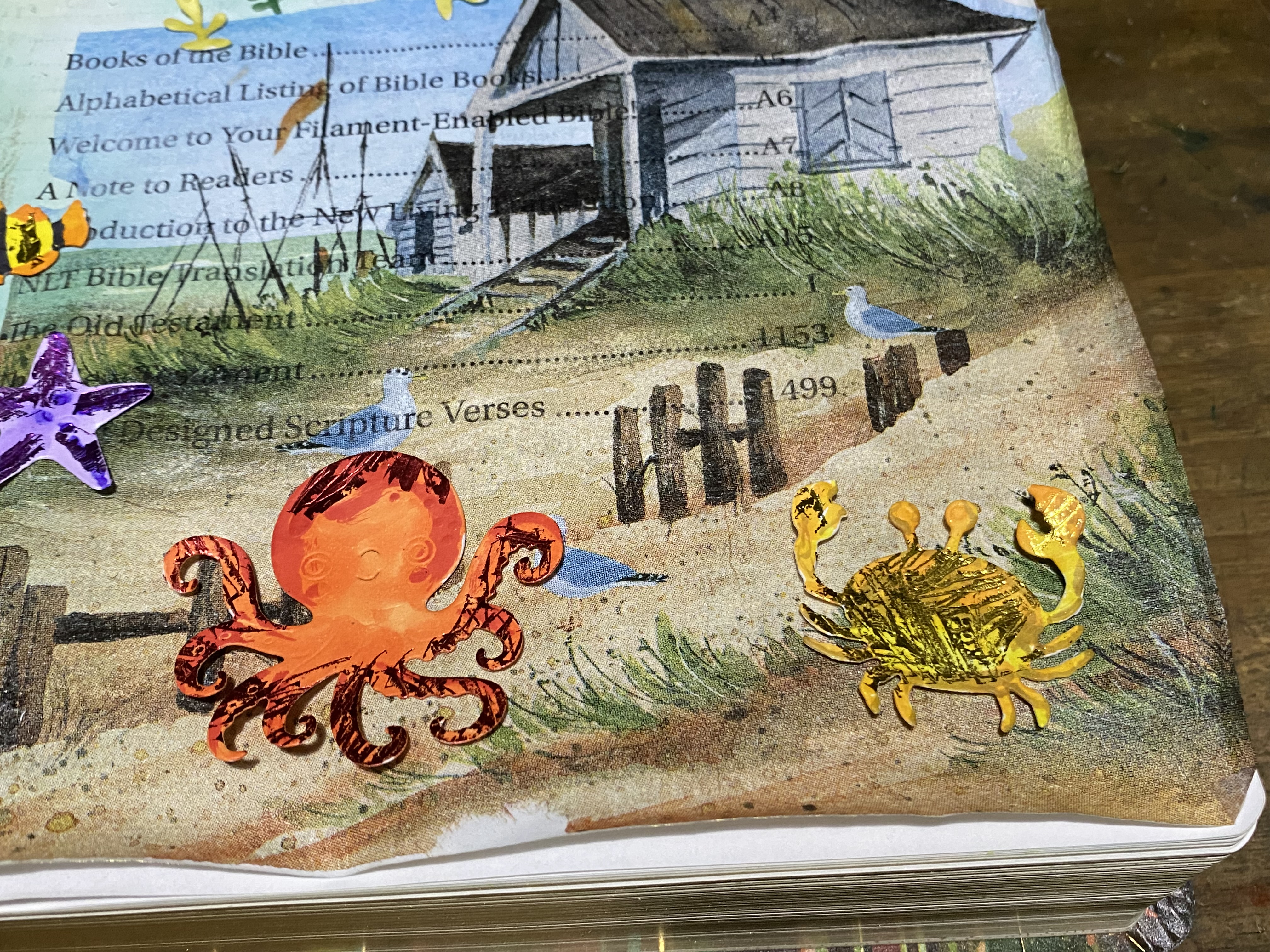
I used some washi tape to finish the edges of the pictures in a decorative manner.

It was now time to glue the die-cut images in place.

I am happy with the final result. It conveys the message I was looking to share and my mind was concentrated on this idea all the while I was busy with the page, making it time well spent in the Word, even though these were not pages filled with Bible passages.

Marietjie Uys (Miekie) is a published author. You can buy my books here:
You can purchase Designs By Miekie 1 here.Jy kan Kom Ons Teken en Verf Tuinstories hier koop.
Jy kan Kom Ons Kleur Tuinstories In hier koop.
Jy kan Tuinstories hier koop.
You can follow Miekie's daily Bible Study blog, Bybel Legkaart, here in English & Afrikaans.
You may prefer to follow the traveling blog, A Pretty Tourist.
For more crafty ideas and great product reviews, visit A Pretty Talent on Facebook.
If you are in a literary mood, follow Miekie's musings, stories and poetry on A Pretty Author - Miekie.
Remember to keep nurturing your TALENT for making life PRETTY.
You can subscribe to any of these blogs and receive regular updates by email. Simply register your email address at the top of the applicable blog.
No comments:
Post a Comment