We take another look at those very special photos we were working with yesterday and rethink the use of sepia. I explained in yesterday's blog why I chose to print the photos in sepia, but what the sepia could never show was the especially rosy feet of the baby. This was after all the perfect pink foot, without the need for photo-shopping it. I then decided that the album could actually accommodate a second set of photos! Normally this would be unheard of, but if we keep the layouts similar, yet the approach different, our viewers will not feel as we are trying to cheat them into thinking that they are looking at more photos, but will be able to appreciate that we are pointing out different features of the same photos.
I choose my background paper to match the cute pink foot on the one photo. Unlike the sepia photos, where I worked on a printed background, I choose to work on monochrome paper this time around.
I want to use this flowery ribbon in the layout and choose the colors for the borders to match the ribbon. I test the sequence of the double frames by laying the options side by side. I like the brighter one on the outside and this will be the biggest frame.
I retain the maximum size on the outer frame, which is 21 x 30 cm, and cut it 2 cm wide. I use a craft knife and metal ruler to do this, while using the markings on the cutting mat to guide me.
I crop the inner frame to measure 19 x 28 cm.
I then cut the inner frame to also be 2 cm wide.
I now need to crop my photos to fit in the frames. This means the photos need to measure 17 x 26 cm.
Attach the frames with double-sided tape.
When sticking the photos down, I make sure to position the papers side by side so the photos will lie at exactly the same height on the page.
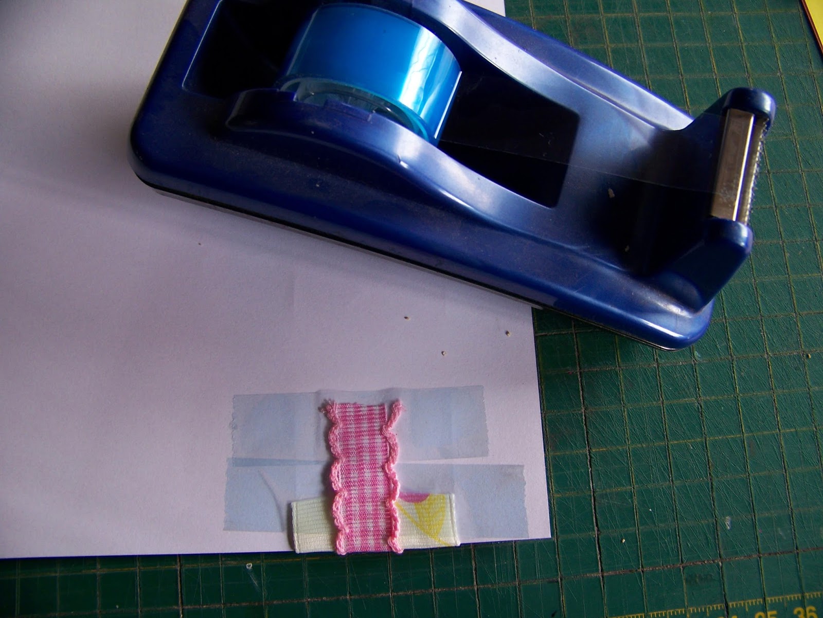
I now cut the ribbon to be slightly longer than the width of the paper so I can fold the ends over. The ribbon is attached with double-sided tape.
I lay a second ribbon on top of the first and attach it too with double-sided tape, folding the sides over at the ends. This time I weave the ribbon through a cardboard and glitter buckle. I do this only on one of the pages, believing that even though I keep repeating my actions on one page on the next as well, it would be too much to add a second buckle.
Again, the papers are laid side by side to get the ribbons in line on the two pages.
I have these two cute fairies that I want to add to the layout, along with the toadstools. The wood is too bland and I decide to glue some glitter on the fairies. I start by applying glue to the faces, legs and arms.
I sprinkle white glitter on the wet glue. I shake off the excess and use the paper plate as a funnel to put the excess back in the bottle.
I repeat the same process with the pink glitter, this time applying the glue to their wings and bodies.
I apply only a little bit of glue to the back of the fairies and lay them in place on the paper. Both the backs and fronts can dry on the paper as keep working on the layout. If you are uncomfortable with this, you may choose to put them aside to dry before adding them to the layout.
I love wooden embellishments for paper crafts because they automatically add dimension and texture to the layout. Here you can see the row of mushrooms/toadstools I added to the bottom of the layout.
I have a printed craft paper off-cut left over from a previous project and I like that this will add some additional color to my layout. Too much pink and yellow becomes boring. Always try to incorporate more colors, even if only in small amounts. I punch four tags from this paper.
I punch the journaling for the layout from the same off-cut. I also two small hands and feet from this paper.
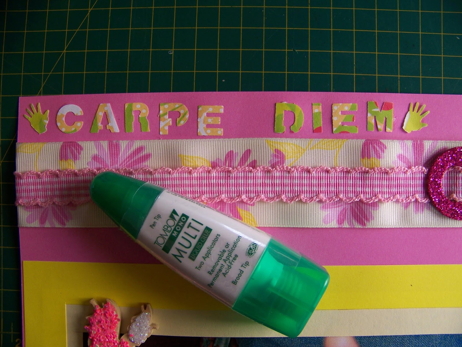
I attach the journaling and hands and feet with Tombow glue to the layout. The Tombow has a very fine point which allows for precision work.
I use an awl to punch a hole through the tags and the paper so I can attach it with split pins to the layout.
I vary where I place the journaling and the tags to make it a little more interesting.
The feet are also not placed in the same position as the hands.
The final layout is exactly similar to the previous, but this different approach to it has resulted in a brand new look.
For more crafty ideas and great products, visit APrettyTalent.com.
Remember to keep nurturing your TALENT for making PRETTY things.
You can subscribe to this blog and receive regular updates by email by simply registering your email address at the top of the current blog.
This blog is about empowering everyone who has a talent for making pretty things, be it a latent or developed one. I bring you practical tips and tricks to make and do the things you've always wanted to.
Search This Blog
Thursday, 2 July 2015
Wednesday, 1 July 2015
Scrapbooking 8: Working in sepia
We sometimes have the cutest of images that we choose to print in sepia for two reasons; one is that color would distract the focus from the image, and the second is that using sepia adds a bit of old-worldly charm. However, we need to plan our layout carefully when scrapping these photos if we want them to appear to their best advantage. Today we focus on this aspect, look at the use of corner punches and how to incorporate a transparent organza ribbon.
I have two of the most precious pictures to work with. The photos of this little lady's hand and foot was taken when she came home from hospital on Christmas day. I want to make sure that whatever I do, the focus must remain on the images. I select paper with a color scheme that compliments the sepia color of the photos.
I find two coordinating papers to cut frames from, an old gold that reinforces the idea of age created by the use of sepia photos, and a rich deep burgundy.
I cut a 2 cm wide frame for the outer frame from the burgundy, measuring 21 x 30 cm.
I crop the gold to measure 19 x 28 cm. I use the cutting mat as a guide and use a craft knife and metal ruler for the actual cutting.
After cropping the gold, I cut a 2 cm wide frame from the paper, using my cutting mat as a guide.
I now need to crop my photo to fit into the frames I created for it. I crop the dead space where nothing is happening from the photo so the photo measures 17 x 26 cm. I purposefully do not crop the date from the photo as this will be an important part of the life story of this little baby as she grows up.
I test the layout when I am done, before I stick anything down. I could also have placed the gold on top of the burgundy if that suited the layout better. Always play around with different options to make sure you get the absolute best results.
I use a pair of scissors to cut short lengths of double-sided tape to glue everything in place.
I wish to decorate the corners of the frames in yet another attempt to bring the feeling of old-worldliness to the layout. I use a cornet punch to achieve this. Position the paper in the corner, pushing it in as deep as it will go. Line the edges of the paper up with the guides in the punch and then press down.
A pretty little decorative corner results with very little effort.
I have a piece of organza ribbon that suits the layout beautifully and I would love to use this. The problem with organza ribbon is that it is transparent. This presents no difficulty when working on a plain background, but it gets tricky when you have a busy printed background as the one I am working on. In order for the design on the ribbon to come to the foreground, I will need to create a plain background to stick it on.
I use the same burgundy paper that I've used for the frames to cut two strips of paper from, each measuring 4 x 30 cm.
I paste the strips of paper in place where I want the organza borders to go. Don't fret the fact that the paper does not run all the way to the sides of the paper. Once the ribbon is in place, it will hardly be noticeable.
When using ribbon as a border, I often cut the ribbon longer than the width of the paper, opting to fold it back, rather than cutting it off at the edges of the paper. The reason for this is that I avoid having frayed edges visible to the viewer.
Simply fold the ribbon neatly over the sides of the paper and tape it down with selotape.
You have now created a very pretty border that coordinates very well with the layout, yet does not detract attention from the photo.
I do not want to add embellishments that will draw the attention away from the photos. For this reason I punch flowers from the same paper stock I used for the borders. Seeing as the background paper has a flower motif, I have not added anything that isn't already on the paper, not in color or motif. That is keeping it simple. What is more, I have allowed the flowers to run into the photos, creating a line for the eye to follow that will lead it right to the important spots in the photos.
I use an awl to line the photos up in the center.
I then drive my paper kebab through the paper where I want the flower to go, still using the awl to keep everything lined up and to make the necessary holes.
I carefully remove the awl and drive a small split pin through the holes, fastening the flower to the paper.
Open the pin at the back and it the flower is secured.
Looking at the layout I decide that I do not want to add journaling, but to rather let the pictures speak for themselves. I do feel that I need something on the left of both the pages in the double-page spread to bring balance to the heavy right hand sides. I find that one of my punches will be perfect for this. It punches three different sized tags at once. I punch three tags each from the burgundy and from the old gold papers.
I arrange the tags in alternating colors and attach it to the paper in the same way as I did the flowers.
Stepping back, I decide that I have created exactly what I set out to do; a formal layout with a hint of nostalgia and all the focus on those super sweet, tiny limbs.
For more crafty ideas and great products, visit APrettyTalent.com.
Remember to keep nurturing your TALENT for making PRETTY things.
You can subscribe to this blog and receive regular updates by email by simply registering your email address at the top of the current blog.
I have two of the most precious pictures to work with. The photos of this little lady's hand and foot was taken when she came home from hospital on Christmas day. I want to make sure that whatever I do, the focus must remain on the images. I select paper with a color scheme that compliments the sepia color of the photos.
I find two coordinating papers to cut frames from, an old gold that reinforces the idea of age created by the use of sepia photos, and a rich deep burgundy.
I cut a 2 cm wide frame for the outer frame from the burgundy, measuring 21 x 30 cm.
I crop the gold to measure 19 x 28 cm. I use the cutting mat as a guide and use a craft knife and metal ruler for the actual cutting.
After cropping the gold, I cut a 2 cm wide frame from the paper, using my cutting mat as a guide.
I now need to crop my photo to fit into the frames I created for it. I crop the dead space where nothing is happening from the photo so the photo measures 17 x 26 cm. I purposefully do not crop the date from the photo as this will be an important part of the life story of this little baby as she grows up.
I test the layout when I am done, before I stick anything down. I could also have placed the gold on top of the burgundy if that suited the layout better. Always play around with different options to make sure you get the absolute best results.
I use a pair of scissors to cut short lengths of double-sided tape to glue everything in place.
I wish to decorate the corners of the frames in yet another attempt to bring the feeling of old-worldliness to the layout. I use a cornet punch to achieve this. Position the paper in the corner, pushing it in as deep as it will go. Line the edges of the paper up with the guides in the punch and then press down.
A pretty little decorative corner results with very little effort.
I have a piece of organza ribbon that suits the layout beautifully and I would love to use this. The problem with organza ribbon is that it is transparent. This presents no difficulty when working on a plain background, but it gets tricky when you have a busy printed background as the one I am working on. In order for the design on the ribbon to come to the foreground, I will need to create a plain background to stick it on.
I use the same burgundy paper that I've used for the frames to cut two strips of paper from, each measuring 4 x 30 cm.
I paste the strips of paper in place where I want the organza borders to go. Don't fret the fact that the paper does not run all the way to the sides of the paper. Once the ribbon is in place, it will hardly be noticeable.
When using ribbon as a border, I often cut the ribbon longer than the width of the paper, opting to fold it back, rather than cutting it off at the edges of the paper. The reason for this is that I avoid having frayed edges visible to the viewer.
Simply fold the ribbon neatly over the sides of the paper and tape it down with selotape.
You have now created a very pretty border that coordinates very well with the layout, yet does not detract attention from the photo.
I do not want to add embellishments that will draw the attention away from the photos. For this reason I punch flowers from the same paper stock I used for the borders. Seeing as the background paper has a flower motif, I have not added anything that isn't already on the paper, not in color or motif. That is keeping it simple. What is more, I have allowed the flowers to run into the photos, creating a line for the eye to follow that will lead it right to the important spots in the photos.
I use an awl to line the photos up in the center.
I then drive my paper kebab through the paper where I want the flower to go, still using the awl to keep everything lined up and to make the necessary holes.
I carefully remove the awl and drive a small split pin through the holes, fastening the flower to the paper.
Open the pin at the back and it the flower is secured.
Looking at the layout I decide that I do not want to add journaling, but to rather let the pictures speak for themselves. I do feel that I need something on the left of both the pages in the double-page spread to bring balance to the heavy right hand sides. I find that one of my punches will be perfect for this. It punches three different sized tags at once. I punch three tags each from the burgundy and from the old gold papers.
I arrange the tags in alternating colors and attach it to the paper in the same way as I did the flowers.
Stepping back, I decide that I have created exactly what I set out to do; a formal layout with a hint of nostalgia and all the focus on those super sweet, tiny limbs.
For more crafty ideas and great products, visit APrettyTalent.com.
Remember to keep nurturing your TALENT for making PRETTY things.
You can subscribe to this blog and receive regular updates by email by simply registering your email address at the top of the current blog.
Subscribe to:
Posts (Atom)