Search This Blog

Thursday, 5 April 2018

Painting A Frazzled Ostrich In Acrylics

I love ostriches. They are such whimsical birds, and I associate them with good times, as they seemed to be around on most of my fun holidays and tours. In today's project I show you how to paint a rather frazzled looking ostrich. We use lots of fun colours in this painting to make sure it does not take a moody undertone. The process is one of pure joy and relaxation. I used acrylics as medium in this painting.


I start on a deep-frame canvas board for the surface that I paint on.


I prepare the surface by giving it two coats of gesso. waiting for each coat to dry before continuing.


The surface is now ready for me to paint on it.


I start with Red Oxide and Natural Grey.
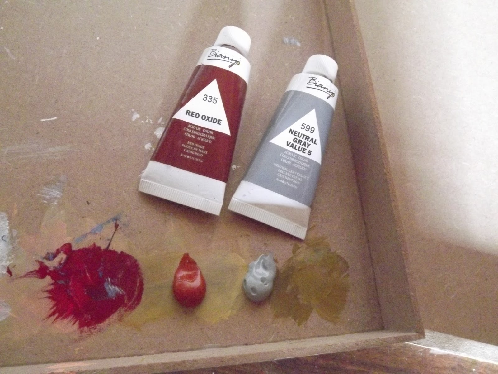

I cleaned my palette from an earlier project on this board, but this will not affect my painting in the least, unless it made it more interesting. I paint the whole of background with the red oxide.


I then paint the sides in natural grey.


I also paint the very center, where the head of the ostrich will be, with natural grey.


I then use charcoal to draw a very simple outline for the face of the ostrich.


I want the colours that I use, to reflect as brightly as possible. I therefore start by painting the mouth white, before painting it the colours I would like it to be.


The mouth is then painted pink and the rest of the head and neck is painted white, as well as the eyes.


The face and neck is then painted blue.


The pupils are painted black and shadows are added all over the face. I also paint in nostrils, and the line for the mouth opening.


The blue eyes are painted green.


I use the natural grey to start adding thick feathers.


Blue is added to paint more thick feathers.


Next, I use pink to add more thick feathers.


I then switch to a rigger brush to add thin black feathers.


I finish off by using my large brush to add white highlights. I then add thin white brush strokes for fine white feathers, using the rigger brush. Adding the white at the end, is what brings everything together in this whimsical creature.


Marietjie Uys (Miekie) is a published author. You can buy my books here:
You can purchase Designs By Miekie 1 here.
Jy kan Kom Ons Teken en Verf Tuinstories hier koop.
Jy kan Kom Ons Kleur Tuinstories In hier koop.
Jy kan Tuinstories hier koop.
You can follow Miekie's daily Bible Study blog, Bybel Legkaart, here in English & Afrikaans.
You may prefer to follow the traveling blog, A Pretty Tourist.
For more crafty ideas and great product reviews, visit A Pretty Talent on Facebook.
If you are in a literary mood, follow Miekie's musings, stories and poetry on A Pretty Author - Miekie.
Remember to keep nurturing your TALENT for making life PRETTY.
You can subscribe to any of these blogs and receive regular updates by email. Simply register your email address at the top of the applicable blog.

Wednesday, 4 April 2018

Painting Rain In Acrylics

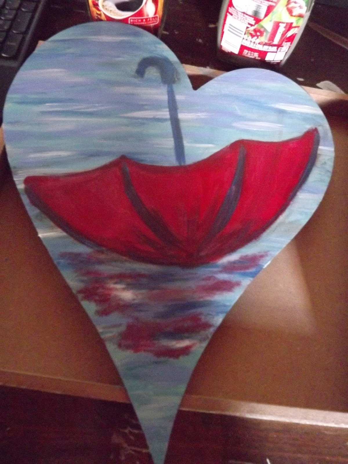
There are a couple of techniques to use when painting rain. I show you one of these techniques when doing today's paintings, which is a set of two. I use heart-shaped canvasses as my backgrounds to illustrate my love of rain. As I do not mind getting wet, I go so far as to discard the umbrella in one of the paintings. I use acrylic paint as a medium.


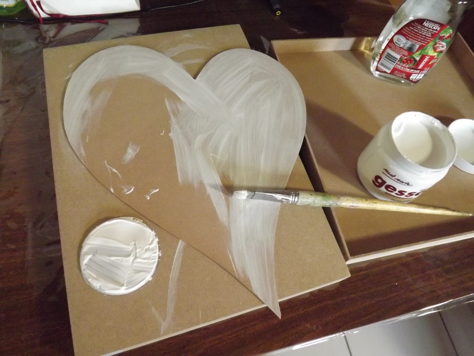
I work on masonite backgrounds in these two paintings and start by prepping the surfaces with two layers of gesso. I wait for the gesso to dry in between coatings.


The surface is now prepped and ready to be painted on. Gesso gives the paint a proper surface to cling to, as well as to give you a stark white background to start on, which will help to make the true colours of the paint reflect more brightly.


I draw a discarded umbrella in charcoal.


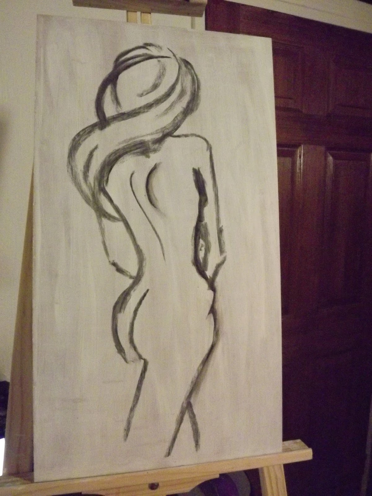
I also draw the figure of a woman walking in the wind and rain, with an umbrella covering her face and head, in charcoal.


I start with a selection of blues that appeal to me as well as mixing white. This white is semi-transparent, unlike Titanium White which is completely opaque.


The canvas is covered in the four colours I selected above. In places, the colours mix as well, creating even more shades of blue.


I now add a brilliant red for the umbrella.


Do not forget to paint the reflection of the umbrella in the rain.


I paint the handle and the shadows of the umbrella in black.


I add highlights to the umbrella with mixing white.


I use the mixing white to paint the pouring rain at an angle.


Where the drops hit the surface of the ground, it splashes up in short v's with feathers.


Towards the back, the v's of the drops hitting the surface, must become even shorter to create the illusion of depth.


The second background is painted much the same as the first.


The umbrella is once again painted red.


Shadows are added in black.


Highlights are added with mixing white and blue.


I now add the opaque Titanium White to my palette to paint the figure with.


The figure in painted with the Titanium White.


White always reflects its surroundings and I now make sure it happens here as well.


The rain is painted in at a slant.


The drops are painted in feathered v's.


I paint the legs of the figure with a combination of blue and black as it is clad in shade. Add a bit of white for highlights and red to warm it up.


The finished painting.


The finished painting.


The two paintings side by side.


Marietjie Uys (Miekie) is a published author. You can buy my books here:
You can purchase Designs By Miekie 1 here.
Jy kan Kom Ons Teken en Verf Tuinstories hier koop.
Jy kan Kom Ons Kleur Tuinstories In hier koop.
Jy kan Tuinstories hier koop.
You can follow Miekie's daily Bible Study blog, Bybel Legkaart, here in English & Afrikaans.
You may prefer to follow the traveling blog, A Pretty Tourist.
For more crafty ideas and great product reviews, visit A Pretty Talent on Facebook.
If you are in a literary mood, follow Miekie's musings, stories and poetry on A Pretty Author - Miekie.
Remember to keep nurturing your TALENT for making life PRETTY.
You can subscribe to any of these blogs and receive regular updates by email. Simply register your email address at the top of the applicable blog.
Tuesday, 3 April 2018

Painting A Nude In Acrylics

While I was working on yesterday's abstract nude, I was also painting a more realistic version, at the same time. I decided to keep the backgrounds similar, but to change my tactics and style completely when it came to the figures themselves. For this painting, I paid much more attention to the detail of the lines, and to getting the light and shadows just right.


I once again started on a wooden box canvas.


This was given two coats of gesso and allowed to dry completely.


I found a line drawing on Pinterest to inspire me and drew a similar figure on the canvas with charcoal.


I used a variety of warm and cold colours to paint the background.


I did not mix the colours on the palette, but rather mixed it on the canvas.


I used a variety of colours to paint the rich skin tones.


Keeping this nude more realistic, I paid closer attention to where the light would fall on the figure, and which parts would be clad in shadow.


I repeated the colours I already had on the palette when I painted the hair.


The completed painting.


Marietjie Uys (Miekie) is a published author. You can buy my books here:
You can purchase Designs By Miekie 1 here.
Jy kan Kom Ons Teken en Verf Tuinstories hier koop.
Jy kan Kom Ons Kleur Tuinstories In hier koop.
Jy kan Tuinstories hier koop.
You can follow Miekie's daily Bible Study blog, Bybel Legkaart, here in English & Afrikaans.
You may prefer to follow the traveling blog, A Pretty Tourist.
For more crafty ideas and great product reviews, visit A Pretty Talent on Facebook.
If you are in a literary mood, follow Miekie's musings, stories and poetry on A Pretty Author - Miekie.
Remember to keep nurturing your TALENT for making life PRETTY.
You can subscribe to any of these blogs and receive regular updates by email. Simply register your email address at the top of the applicable blog.

Monday, 2 April 2018

Painting An Abstract Nude in Acrylics

I never thought I would paint nudes, but someone recently intrigued me in a discussion, and I decided to give it a go with two different takes on this theme. The first of these is a rather more abstract rendition where lines were allowed to merge and flow into each other. The painting was also stripped of its detail, so that it gives the impression of a figure rather than pertinently bringing it to your attention. I show you how to do this painting in a couple of quick steps in today's blog.


I started with a wooden box canvas.


This was prepped with gesso.


It was given a second coat of gesso and left to dry completely.


I then drew the figure on the canvas with charcoal, taking my inspiration from a line drawing I discovered on Pinterest.


I started with the background, which was painted in a mixture of warmer and colder colours.


None of the colours were mixed on the palette, but rather by dipping the brush in more than one colour, before applying it to the canvas.


I used several colours to create the rich skin tones.


I did not pay too much attention to 'correct' play of light and shadow, as I wanted a more surreal and abstract effect, only hinting at this being a figure.


Marietjie Uys (Miekie) is a published author. You can buy my books here:
You can purchase Designs By Miekie 1 here.
Jy kan Kom Ons Teken en Verf Tuinstories hier koop.
Jy kan Kom Ons Kleur Tuinstories In hier koop.
Jy kan Tuinstories hier koop.
You can follow Miekie's daily Bible Study blog, Bybel Legkaart, here in English & Afrikaans.
You may prefer to follow the traveling blog, A Pretty Tourist.
For more crafty ideas and great product reviews, visit A Pretty Talent on Facebook.
If you are in a literary mood, follow Miekie's musings, stories and poetry on A Pretty Author - Miekie.
Remember to keep nurturing your TALENT for making life PRETTY.
You can subscribe to any of these blogs and receive regular updates by email. Simply register your email address at the top of the applicable blog.