Last year I bought myself a more affordable set of pencils, Brutfuner, after watching a review of these pencils online. I was pleasantly impressed with how gently these pencils applied to paper and by the vibrancy of the colours. I have been in love with them ever since and have finally decided to do a blog on these. Let me walk you through the steps on how I coloured in the first page of my brand new Bible. But allow me to first tell you a little more about this Bible and some of its features.

I bought the large print edition of the Inspire Bible, which is a New Living Translation. It is, of course, also a creative Bible, which means that it has wider margins and colouring pictures.
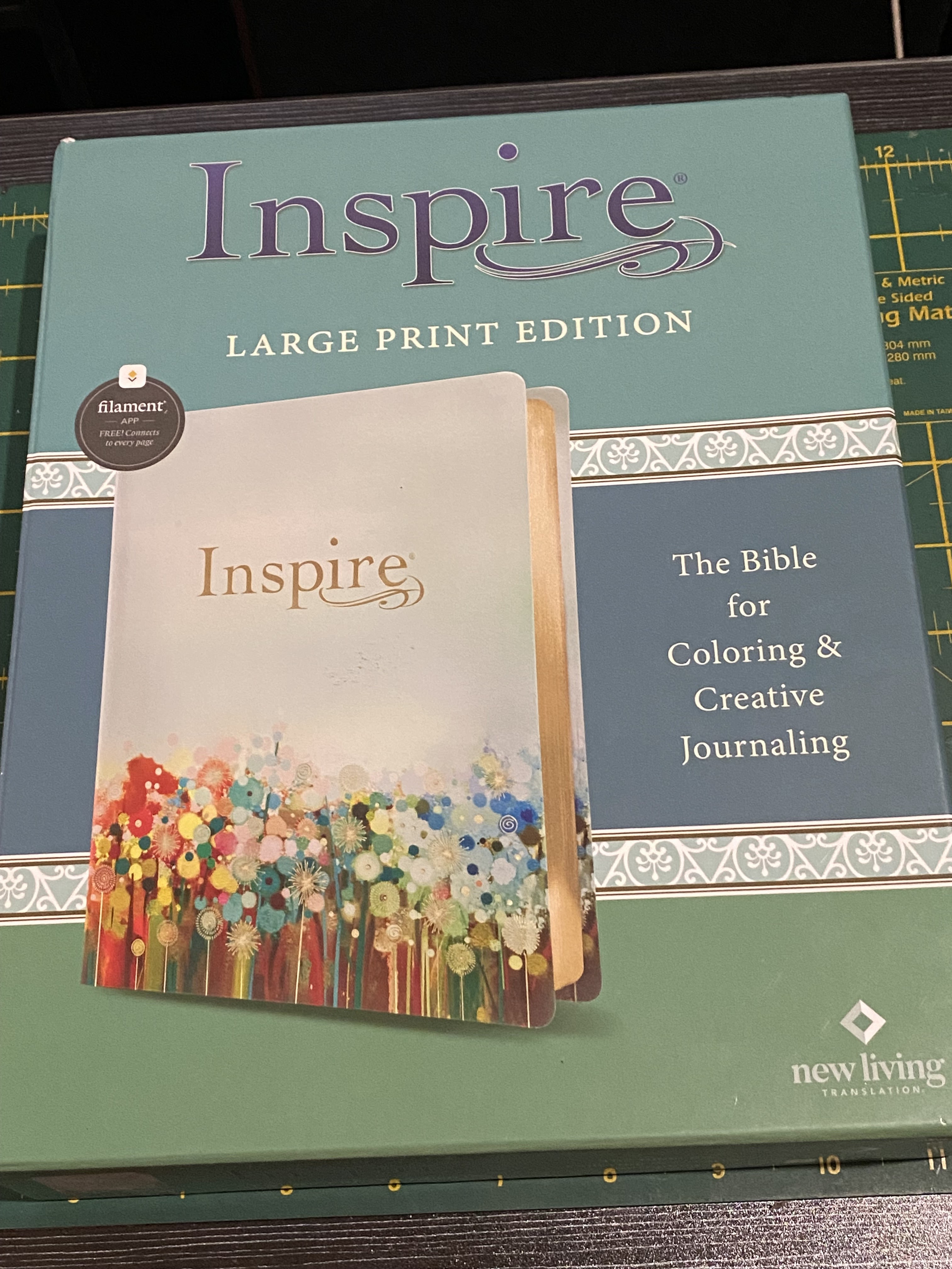
I will include a phot of the back of the box that has more information for those who may be interested.

The Bible also features QR codes that can be scanned and which will provided access to the Filament app. Download the app on your device from the QR code provided in the Bible. I have take screen shots of my phone to show you what to look out for.

Each page has its own Filament code that can be scanned. You will then be taken to extra resources on those specific Bible passages on the app.

I have clicked on 'See' and was taken to maps and videos on the passage. The app is linked to The Bible Project (or works with them) and is absolutely amazing. A real gem!

This is what the Bible looks like when it is unboxed.

I opened at a random page to give you an idea of the the inside of the Bible.

Here you can see the width of the margins where there are not pictures. Note the dotted lines for the times when you wish to journal in words, rather than pictures.

I wanted to start by colouring the inside cover pages at the front of the Bible.

I used a golden gel pen to colour the word 'God.' Before the gel had time to dry, I would blend it with a dry brush. This makes the gel colouring less grainy (less 'liny').

The reason I chose to use a gel pen for the word 'God', was to make it stand out from the rest of the page. It is bright and shiny and has become a focal point, as the true God should be in all of our lives.

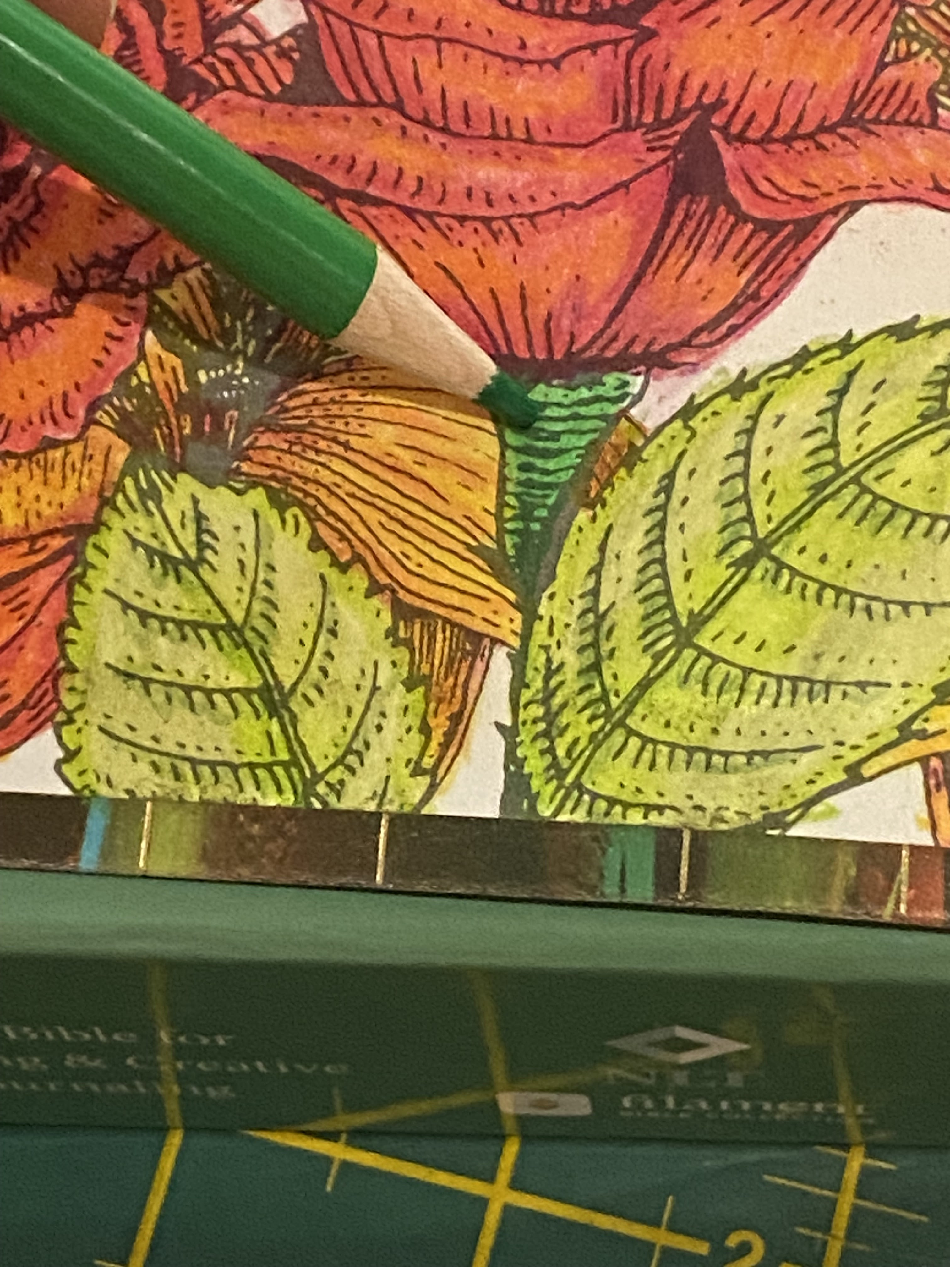
I then use small circular movements with a number 011 pencil to start colouring some of the flowers with a base colour. The whole shape is filled with the base colour. Use very light and gentle strokes.


I then use a 070 pencil to start adding shade to the darker areas. I allowed myself to be guided by the shading already done for me by the creator of the picture.


I lay down the darkest tones in the absolute darkest areas using 088.


I then coloured the whole flower with a 064 pencil, which was effectively used as a blender to 'melt' the colours together.


I then turned my attention to the leaves and laid down the base with 066.

The middle tone was 072.


The deep shade was done with 120.


I used the white 032 to blend with.


The center of the flowers was done with 032.

I added the black 005.


I recovered it with 112.

Moving on to the next flower shape with its leaves, I started on the leaves with a base of 080


The middle tone was 042.


The deep shades were done in 048.


I blended with a deep 096.


The next flower shape was done in a base of 074.


The middle tone was 900.


The deep shade was 018.


I blended with 003.


The flower centres were coloured using 048.


I also did the stems in 048.

The roses were based with 006.


The middle tone was 007.


Deep shade was 052.


I blended with 010.


The roses appeared dull, so I added an even deeper shade with 088.


I then added light with 050. Finally, I was satisfied.


I based the leaves with a pencil where the number had misprinted during manufacturing. My apologies, but I can't tell the number of this pencil. My best advice is to try to match your own set as best you can to the colour displayed on your screen.

The middle tone was 073, but I did not add a darker shade due to space constraints.


I blended with 045.


I based the berries with 038, as I wished to restore tonal balance by adding a cooler colour to the page.


The mid-tone was 041.


Deep shade was 030.


I blended with white in 032.


Stems were done in a neutral 094. Neutral colours help to 'ground' a picture. It restores peace to a vibrant picture.


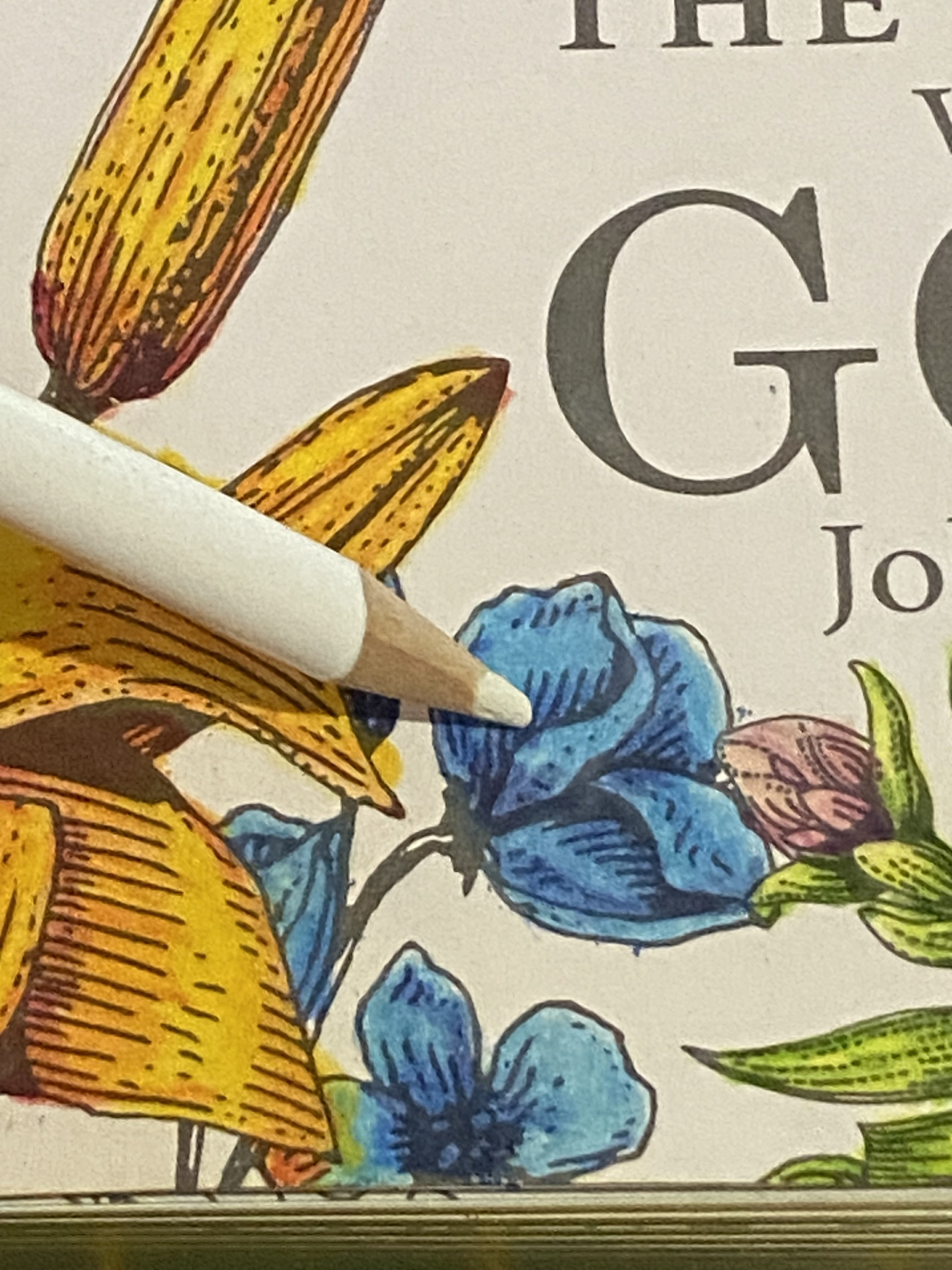
The next set of flowers were based with 107.


I blended with 017.


The leaves were based with 057.


The middle tone was 047.


I blended with 094.


I wished to add more neutral colours and based the next flowers with 075.


The mid-tone was 025.


Deep shade and stems were done with 021.


I blended with 102.


The dark leaves simply received 048.


I still wished to cool the tonal value down further and added more cool colours in the next set of flowers with a base of 039.

Mid-tones were 034.

Deep shade was 039.


I blended using 032.

Leaves and stems were done with 073.


I based the banner with 049.


Mid-tones were done with 003.


Deep shade was 069.


I blended with 032.


I decided to add more depth to the berries with 019, now that the flowers were all coloured and the overall picture started to emerge.


I then turned my attention to the birds and coloured the eyes, beaks and legs with 003.

I shaded with 078.


I started a partial base colour with B68.


I shaded and partially based with B33.


I continued with B46.


I finished with B33.


I returned with partial blending using B48. The B-range are the metallic pencil range of Brutfuner.


I based the bodies of the butterflies with B49.


I shaded (rounded) the sides with 023.


I partially based the wings with B45.


I continued the wings with 050.


I added contrast with the black 028.


My picture was now fully coloured, but not yet done.

I blended the background with two shades of Distress Ink; Faded Jeans and Blueprint Sketch.

I used the tip of a fantasy marker to blend the butterflies with Milled Lavender Distress Ink.

I added some sparkly golden highlights with a golden gel pen to the banner.

I added some depth and light to the eyes of the birds with a sparkly black gel pen and a white gel pen.

I used the same black gel pen to highlight the dark areas on the bodies and wings of the butterflies.

This is the final result. Happy colouring!

You can purchase Designs By Miekie 1 here.
Jy kan Kom Ons Teken en Verf Tuinstories hier koop.
Jy kan Kom Ons Kleur Tuinstories In hier koop.
Jy kan Tuinstories hier koop.
You can follow Miekie's daily Bible Study blog, Bybel Legkaart, here in English & Afrikaans.
You may prefer to follow the traveling blog, A Pretty Tourist.
For more crafty ideas and great product reviews, visit A Pretty Talent on Facebook.
If you are in a literary mood, follow Miekie's musings, stories and poetry on A Pretty Author - Miekie.
Remember to keep nurturing your TALENT for making life PRETTY.
You can subscribe to any of these blogs and receive regular updates by email. Simply register your email address at the top of the applicable blog.